Events & Promotions
|
|

GMAT Club Daily Prep
Thank you for using the timer - this advanced tool can estimate your performance and suggest more practice questions. We have subscribed you to Daily Prep Questions via email.
Customized
for You
Track
Your Progress
Practice
Pays
Not interested in getting valuable practice questions and articles delivered to your email? No problem, unsubscribe here.
 Nov 19
12:30 PM EST
-01:30 PM EST
Learn how Keshav, a Chartered Accountant, scored an impressive 705 on GMAT in just 30 days with GMATWhiz's expert guidance. In this video, he shares preparation tips and strategies that worked for him, including the mock, time management, and more Nov 20
01:30 PM EST
-02:30 PM IST
Learn how Kamakshi achieved a GMAT 675 with an impressive 96th %ile in Data Insights. Discover the unique methods and exam strategies that helped her excel in DI along with other sections for a balanced and high score. Nov 22
11:00 AM IST
-01:00 PM IST
Do RC/MSR passages scare you? e-GMAT is conducting a masterclass to help you learn – Learn effective reading strategies Tackle difficult RC & MSR with confidence Excel in timed test environment- Nov 23
11:00 AM IST
-01:00 PM IST
Attend this free GMAT Algebra Webinar and learn how to master the most challenging Inequalities and Absolute Value problems with ease.  Nov 24
07:00 PM PST
-08:00 PM PST
Full-length FE mock with insightful analytics, weakness diagnosis, and video explanations! Nov 25
10:00 AM EST
-11:00 AM EST
Prefer video-based learning? The Target Test Prep OnDemand course is a one-of-a-kind video masterclass featuring 400 hours of lecture-style teaching by Scott Woodbury-Stewart, founder of Target Test Prep and one of the most accomplished GMAT instructors.


Dropdown 1: 4
Dropdown 2: no longer be positively correlated
Be sure to select an answer first to save it in the Error Log before revealing the correct answer (OA)!
Difficulty:
 95%
(hard)
95%
(hard)
Question Stats:
31% (02:16) correct 69%
(02:37)
wrong
based on 2833
sessions
69%
(02:37)
wrong
based on 2833
sessions
History
Date
Time
Result
Not Attempted Yet
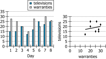
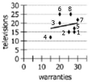
For a certain electronics retailer during each of eight days, both of the graphs show the number of televisions sold and the number of extended warranties sold (whether for televisions or for any other products sold at the store). The scatterplot also includes a trendline that shows the correlation between the daily numbers of televisions and warranties sold.
Select from the drop-down menus the options that complete the statement so that it is accurate based on the information provided.
Among the days represented in the graphs, without the data for Day , the daily numbers of televisions and extended warranties sold would .
ID: 700244
ShowHide Answer
Official Answer
Dropdown 1: 4
Dropdown 2: no longer be positively correlated

Kudos
Bookmarks
i believe there is a error in the answer of this question, Abhivas chetan2u ... if we exclude point 6, the correlation will increase (from 0.047 to 0.213. see table and graph attached), making for instance the selections "Day 6" and "still be positively, though more strongly, correlated" a valid set of answer
Attachments
table2.png [ 20.83 KiB | Viewed 20376 times ]
4d9cfcac-5705-4b31-9ec8-a27c020c0c11.png [ 99.29 KiB | Viewed 20410 times ]

Abhivas
Note that the correlation depicted in the table is not positive correlation. Positive correlation means that if one variable increases, the other increases too and if one decreases, the other decreases too. But what we see is a predominantly negative correlation. When television bar increases/decreases, the warranty bar decreases/increases in most data points. The exception is Day 4 when both decrease together. If I were to remove day 4, the table will depict a negative correlation.
The scatter plot has all the points and the trendline showing positive correlation only because of the first point on the left (circled in Red). This point is the data of Day 4. Remove this point and your trendline changes to the one shown in green. It is negatively correlated. (shown in the attachment)
Hence the ANSWER here will be 'Day 4' and 'No longer positively correlated'.
This question is discussed here on video:
Attachments
Screenshot 2024-03-09 at 2.38.07 PM.png [ 14.92 KiB | Viewed 18394 times ]