Thank you for using the timer - this advanced tool can estimate your performance and suggest more practice questions. We have subscribed you to Daily Prep Questions via email.
Customized for You
we will pick new questions that match your level based on your Timer History
Track Your Progress
every week, we’ll send you an estimated GMAT score based on your performance
Practice Pays
we will pick new questions that match your level based on your Timer History
Not interested in getting valuable practice questions and articles delivered to your email? No problem, unsubscribe here.
Thank you for using the timer!
We noticed you are actually not timing your practice. Click the START button first next time you use the timer.
There are many benefits to timing your practice, including:
Wondering about your chances for top MBA programs? Join ARINGO for a concise Q&A session where we'll evaluate profiles, estimate school prospects, and offer expert tips.
Join us for a transformative live session where we'll demystify GMAT Algebra and show you how to master three of the most challenging topics: linear inequalities, quadratic inequalities, and absolute values.
In this video, we uncover the top errors applicants unknowingly make during MBA interviews and provide actionable tips to avoid them. Watch it carefully to avoid the common mistakes committed by applicants in delivering interviews.
Do RC/MSR passages scare you? e-GMAT is conducting a masterclass to help you learn – Learn effective reading strategies Tackle difficult RC & MSR with confidence Excel in timed test environment
Originally posted by Abhivas on 09 Feb 2024, 15:41.
Last edited by Bunuel on 19 Aug 2024, 03:26, edited 12 times in total.
3
Kudos
Add Kudos
94
Bookmarks
Bookmark this Post
Show timer
00:00
Start Timer
Pause Timer
Resume Timer
Show Answer
Hide Answer
Correct Answer
Hide
Show
History
Dropdown 1: 4
Dropdown 2: no longer be positively correlated
Be sure to select an answer first to save it in the Error Log before revealing the correct answer (OA)!
Select the dropdowns below and click "Submit" to add this question to your Error log.
Difficulty:
95%
(hard)
Question Stats:
34%
(02:20)
correct
66%
(02:37)
wrong
based on 1152
sessions
History
Date
Time
Result
Not Attempted Yet
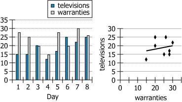
For a certain electronics retailer during each of eight days, both of the graphs show the number of televisions sold and the number of extended warranties sold (whether for televisions or for any other products sold at the store). The scatterplot also includes a trendline that shows the correlation between the daily numbers of televisions and warranties sold.
Select from the drop-down menus the options that complete the statement so that it is accurate based on the information provided.
Among the days represented in the graphs, without the data for Day , the daily numbers of televisions and extended warranties sold would .
i believe there is a error in the answer of this question, Abhivaschetan2u ... if we exclude point 6, the correlation will increase (from 0.047 to 0.213. see table and graph attached), making for instance the selections "Day 6" and "still be positively, though more strongly, correlated" a valid set of answer
Attachments
table2.png [ 20.83 KiB | Viewed 11105 times ]
4d9cfcac-5705-4b31-9ec8-a27c020c0c11.png [ 99.29 KiB | Viewed 11125 times ]
For a certain electronics retailer during each of eight days, both of the graphs show the number of televisions sold and the number of extended warranties sold (whether for televisions or for any other products sold at the store). The scatterplot also includes a trendline that shows the correlation between the daily numbers of televisions and warranties sold. Select from the drop-down menus the options that complete the statement so that it is accurate based on the information provided. Among the days represented in the graphs, without the data for Day , the daily numbers of televisions and extended warranties sold would .
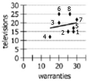
Note that the correlation depicted in the table is not positive correlation. Positive correlation means that if one variable increases, the other increases too and if one decreases, the other decreases too. But what we see is a predominantly negative correlation. When television bar increases/decreases, the warranty bar decreases/increases in most data points. The exception is Day 4 when both decrease together. If I were to remove day 4, the table will depict a negative correlation. The scatter plot has all the points and the trendline showing positive correlation only because of the first point on the left (circled in Red). This point is the data of Day 4. Remove this point and your trendline changes to the one shown in green. It is negatively correlated. (shown in the attachment) Hence the ANSWER here will be 'Day 4' and 'No longer positively correlated'. You can read about Correlation and Trendlines in my Data Insights Module. It will be freely available tomorrow (Sunday) under the Super Sundays program. Details of Super Sundays available here.
Attachments
Screenshot 2024-03-09 at 2.38.07 PM.png [ 14.92 KiB | Viewed 9632 times ]
The answer would depend on the options in the drop downs. Please provide the drop downs.
Also, how you would get the answer would depend on effect removing of those options will have on the line graph on right side.
It is clearly positively related. Now, either it will become stronger or it could become negatively related or zero related. But all that will be specific to the options in first drop down.
Now the correlation means the general trend in data. The right graph gives you that line.
Correlation: The line moves upwards as we move from left to right, that is as we increase number of televisions, there is a general tendency of warranties increasing. (in line graph, x increases as y increases)
So, in the second drop-down, you are left with only two options A and D.
Next look at drop down 1. It talks of three data 4: (15,12.5) - It is the left most point below the line. Just imagine how this point is holding the line in downward position. The moment you release the line from here, it will move upwards almost in between the next two points to immediate right. Now, the right edge of the line remains at (30,20), while the left edge moves up to somewhere at (20,22), in middle of next two points. Thus the slope is (20,22) to (30,20), that is as x increases from 20 to 30, y decreases from 22 to 20. So, it becomes negatively correlated.
In Data point no 6, number of televisions is more than warranties. This is opposite to all other data points. Hence if we remove this then the correlation becomes more positive.
But as per GMAC OE , it seems they are more concerned with the OUTLIERS.
Hello, I see the source says Official Guide. I have the official guide bundle books with me. I see no graph questions in the data insights. Can I ask where I can get these type pf questions?
For a certain electronics retailer during each of eight days, both of the graphs show the number of televisions sold and the number of extended warranties sold (whether for televisions or for any other products sold at the store). The scatterplot also includes a trendline that shows the correlation between the daily numbers of televisions and warranties sold. Select from the drop-down menus the options that complete the statement so that it is accurate based on the information provided. Among the days represented in the graphs, without the data for Day , the daily numbers of televisions and extended warranties sold would .
Note that the correlation depicted in the table is not positive correlation. Positive correlation means that if one variable increases, the other increases too and if one decreases, the other decreases too. But what we see is a predominantly negative correlation. When television bar increases/decreases, the warranty bar decreases/increases in most data points. The exception is Day 4 when both decrease together. If I were to remove day 4, the table will depict a negative correlation. The scatter plot has all the points and the trendline showing positive correlation only because of the first point on the left (circled in Red). This point is the data of Day 4. Remove this point and your trendline changes to the one shown in green. It is negatively correlated. (shown in the attachment) Hence the ANSWER here will be 'Day 4' and 'No longer positively correlated'. You can read about Correlation and Trendlines in my Data Insights Module. It will be freely available tomorrow (Sunday) under the Super Sundays program. Details of Super Sundays available here.
Hi @KarishmaB @chetan2u I understood why 'Day 4' and 'No longer positively correlated' is the answer but i am confused about why Day 1 and still be positively, though more strongly, correlated will not be the answer.
Below is my understanding: Because of Day-1 data, graph is going downwards, but if we remove this Day-1 data, we are removing one negative slope and graph will have a positive slope for MOST of days. Please help!!
For a certain electronics retailer during each of eight days, both of the graphs show the number of televisions sold and the number of extended warranties sold (whether for televisions or for any other products sold at the store). The scatterplot also includes a trendline that shows the correlation between the daily numbers of televisions and warranties sold. Select from the drop-down menus the options that complete the statement so that it is accurate based on the information provided. Among the days represented in the graphs, without the data for Day , the daily numbers of televisions and extended warranties sold would .
Note that the correlation depicted in the table is not positive correlation. Positive correlation means that if one variable increases, the other increases too and if one decreases, the other decreases too. But what we see is a predominantly negative correlation. When television bar increases/decreases, the warranty bar decreases/increases in most data points. The exception is Day 4 when both decrease together. If I were to remove day 4, the table will depict a negative correlation. The scatter plot has all the points and the trendline showing positive correlation only because of the first point on the left (circled in Red). This point is the data of Day 4. Remove this point and your trendline changes to the one shown in green. It is negatively correlated. (shown in the attachment) Hence the ANSWER here will be 'Day 4' and 'No longer positively correlated'. You can read about Correlation and Trendlines in my Data Insights Module. It will be freely available tomorrow (Sunday) under the Super Sundays program. Details of Super Sundays available here. Hi @KarishmaB @chetan2u I understood why 'Day 4' and 'No longer positively correlated' is the answer but i am confused about why Day 1 and still be positively, though more strongly, correlated will not be the answer.
Below is my understanding: Because of Day-1 data, graph is going downwards, but if we remove this Day-1 data, we are removing one negative slope and graph will have a positive slope for MOST of days. Please help!!
Day 1 doesn't have much impact on the correlation. The number of televisions doesn't change from Day 1 to Day 2 and number of warranties decline very slightly. So this data point doesn't give us much information and removing it won't have much impact. On the other hand, Day 4 is actually opposite of the usual trend and removing it reverses the trend. Look at the diagram shared by ruis above and find Day 1 on it. If you remove it, can we say that the line must have become steeper? We can't really say. The placement of points is very similar to before. Removing Day 4 makes a much bigger splash.
So Day 4 would have a bigger effect than Day 1 sure, but at no point in the question prompt does it indicate that we should choose the biggest impact item. In other words, the OA is not the only possible answer. The combination of point 1 & still positively, but not as strongly, correlated would still be correct. Not cool with the OA here.
Can someone explain why Day 6 is not an outlier. What would happen if we removed day 6 from the data? chetan2u
At least to my eyes, I wrote down the approximate coordinates of the trendline [ (17,15) the lower (30,20) the upper ] and the 3 days on the list: d1(15,27) d4(12,15) d6(25,20). Then I saw that d1 has smaller deviation than the other days (x=2 y=7) so it's excluded. 4th day has x=5 y=0 and the 6th is inside (for x) and at the upper limit (for y) so the 4th day is the outlier.
You can see also the scatter plot and you'll see that 4th day is the only one away from the rest and as a result is the one that affects the most.
For a certain electronics retailer during each of eight days, both of the graphs show the number of televisions sold and the number of extended warranties sold (whether for televisions or for any other products sold at the store). The scatterplot also includes a trendline that shows the correlation between the daily numbers of televisions and warranties sold. Select from the drop-down menus the options that complete the statement so that it is accurate based on the information provided. Among the days represented in the graphs, without the data for Day , the daily numbers of televisions and extended warranties sold would .
Note that the correlation depicted in the table is not positive correlation. Positive correlation means that if one variable increases, the other increases too and if one decreases, the other decreases too. But what we see is a predominantly negative correlation. When television bar increases/decreases, the warranty bar decreases/increases in most data points. The exception is Day 4 when both decrease together. If I were to remove day 4, the table will depict a negative correlation. The scatter plot has all the points and the trendline showing positive correlation only because of the first point on the left (circled in Red). This point is the data of Day 4. Remove this point and your trendline changes to the one shown in green. It is negatively correlated. (shown in the attachment) Hence the ANSWER here will be 'Day 4' and 'No longer positively correlated'. You can read about Correlation and Trendlines in my Data Insights Module. It will be freely available tomorrow (Sunday) under the Super Sundays program. Details of Super Sundays available here.
KarishmaB I totally agree with the first part, as according to the approximate coordinates of the trend - line [(17,15) the lower (30,20) the upper] and the 3 days listed d1(15,27) d4(12,15) d6(25,20) we can see that d1 has the smaller deviation (x=2 y=7) and it's excluded, d4 has x=5 y=0 and the d6 is inside (for x) and at the upper limit (for y) so the d4 is the outlier. The scatter plot also points out that 4th day is the only one away from the rest and as a result is the one that affects the most. But for the second part, after also drawing a scatter plot it seems that again the correlation is negative just not so much. Because from day to day when one coordinate for instance decreases (let's say d1 to d2) the other either is the same (d1 to d2) or increases (d3 to d5). Can you help me please on this?
By drawing the trendline with a positive slope, they are implying a positive correlation (though a weak positive correlation). We cannot say that the correlation was negative to begin with because of the trendline in the scatter plot and the mix of data in the bar graph.
After you remove day 4, you do get a clear negative correlation in the bar graph and in the scatter plot and that is why we choose "no longer positively correlated." When one increases the other decreases and vice versa. Look at the data from one day to the next day in the bar graph.
Here is a detailed video solution for this interesting question. See how this question can be solved in the test environment using "Owning the Dataset" approach.