Events & Promotions
|
|

GMAT Club Daily Prep
Thank you for using the timer - this advanced tool can estimate your performance and suggest more practice questions. We have subscribed you to Daily Prep Questions via email.
Customized
for You
Track
Your Progress
Practice
Pays
Not interested in getting valuable practice questions and articles delivered to your email? No problem, unsubscribe here.
 May 19
12:00 PM PDT
-01:00 PM PDT
Scoring 329 on the GRE is not always about using more books, more courses, or a longer study plan. In this episode of GRE Success Talks, Ashutosh shares his GRE preparation strategy, study plan, and test-day experience, explaining how he kept his prep.... May 20
12:30 AM EDT
-01:30 AM EDT
Struggling to find the right strategies to score a 99 %ile on GMAT Focus? Riya (GMAT 715) boosted her score by 100-points in just 15 days! Discover how the right mentorship, tailored strategies, and an unwavering mindset can transform your GMAT prep. May 20
08:00 AM PDT
-08:30 AM PDT
What’s in it for you- Live Profile Evaluation Chat Session with Jenifer Turtschanow, CEO, ARINGO. Come with your details prepared and ARINGO will share insights! Pre-MBA Role/Industry, YOE, Exam Score, C/GPA, ECs Post-MBA Role/ Industry & School List. May 15
01:00 PM IST
-11:00 AM IST
Start your journey with a fully customized action plan and work with a dedicated mentor to achieve a 735+ score. May 21
01:00 AM EDT
-02:00 AM EDT
Looking for your GMAT motivation to break through the score plateau? Pragati improved her score by massive 160 points with strategic guidance and hard-work! Find out how personalized mentorship and a strong mindset can turn GMAT struggles into success. May 23
10:00 AM PDT
-11:00 AM PDT
Video explanations + diagnosis of 10 weakest areas + 150+ short videos + study plan!- Jun 10
06:00 AM PDT
-06:15 PM PDT
Register for the GMAT Club Virtual MBA Spotlight Fair – the world’s premier event for serious MBA candidates. This is your chance to hear directly from Admissions Directors at nearly every Top 30 MBA program..

Kudos
Bookmarks

Dropdown 1: 04 May
Dropdown 2: 01 June
Be sure to select an answer first to save it in the Error Log before revealing the correct answer (OA)!
Difficulty:
 5%
(low)
5%
(low)
Question Stats:
90% (01:21) correct 10%
(01:29)
wrong
based on 1761
sessions
10%
(01:29)
wrong
based on 1761
sessions
History
Date
Time
Result
Not Attempted Yet
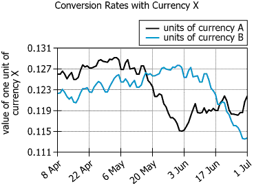
The graph shows the history of the value of currency X—in units of currency A and in units of currency B—for the 12-week period beginning on 8 April.
Based on the information provided, select from each drop-down menu the option that creates the most accurate statement.
For the 12-week period shown in the graph, the greatest value of a unit of currency X expressed in units of currency A occurred around , and the greatest value of a unit of currency X expressed in units of currency B occurred around .
ID: 700206
ShowHide Answer
Official Answer
Dropdown 1: 04 May
Dropdown 2: 01 June
Every tricky question should trigger a follow up quiz.
Build that habit with
GMAT Club Forum Quiz →.

Kudos
Bookmarks
gmatt1476
The black line shows the value of currency X in terms of currency A and blue line shows value of currency X in terms of currency B.
So say on 8th April, the value of 1 unit of currency X is .126 units of currency A and the value of 1 unit of currency X is .122 units of currency B.
For the 12-week period shown in the graph, the greatest value of a unit of currency X expressed in units of currency A occurred around ___, and the greatest value of a unit of currency X expressed in units of currency B occurred around _____.
The black line is highest around 3-4th May and the blue line is highest around 1st June.
ANSWER: 4th May, 1st June


Kudos
Bookmarks
For the 12-week period shown in the graph, the greatest value of a unit of currency X expressed in units of currency A occurred around [04 May], and the greatest value of a unit of currency X expressed in units of currency B occurred around [01 June].
Currency A => black line => greatest is between end of April and 5 May
=> 04 May
Currency B => blue line => greates is between end of May and early of June
=> 01 June
Currency A => black line => greatest is between end of April and 5 May
=> 04 May
Currency B => blue line => greates is between end of May and early of June
=> 01 June