|
|

GMAT Club Daily Prep
Thank you for using the timer - this advanced tool can estimate your performance and suggest more practice questions. We have subscribed you to Daily Prep Questions via email.
Customized
for You
Track
Your Progress
Practice
Pays
Not interested in getting valuable practice questions and articles delivered to your email? No problem, unsubscribe here.

Kudos
Bookmarks

Be sure to select an answer first to save it in the Error Log before revealing the correct answer (OA)!
Difficulty:
 45%
(medium)
45%
(medium)
Question Stats:
29% (00:41) correct 70% (00:30) wrong based on 17 sessions
History
Date
Time
Result
Not Attempted Yet

The random variable X is normally distributed. The values 650 and 850 are at the 60th and 90th percentiles of the distribution of X, respectively.
Quantity A
The value at the 75th percentile of the distribution of X
Quantity B
750
Quantity A
The value at the 75th percentile of the distribution of X
Quantity B
750

Kudos
Bookmarks
When it comes to normal distributions, it might be useful to think of the area under the curve as the ENTIRE population being examined.
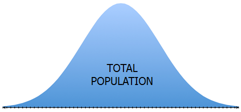
In fact, it helps more of you think of each blue pixel/dot under the curve as representing one member of the population.
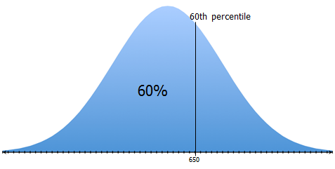
So, if a score of 650 is at the 60th percentile, we know that 60% of all of the blue pixels/dots lie to the left of 650
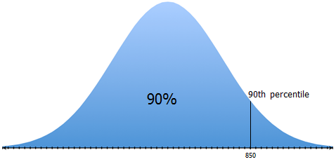
Likewise, if a score of 850 is at the 90th percentile, we know that 90% of all of the blue pixels/dots lie to the left of 850
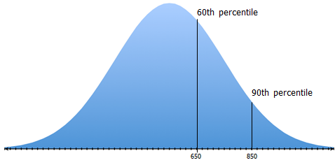
IMPORTANT: If we draw a new line that takes the population BETWEEN the 60th and 90th percentiles and divides that population into two EQUAL populations, then that new line will represent the 75th percentile score.
So, where should that line go?
Well, if we draw it halfway between 650 and 850...
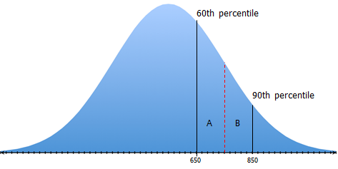
...then more of the population will be on side A.
So, this line will NOT divide the population between the 60th and 90th percentiles into two equal populations.
To get a line the DOES divide the population into two equal populations, we need to draw it right about here...

Notice that the 75th percentile line is to the left of score of 750 (which is halfway between scores of 650 and 850)
So, the SCORE associated with the 75th percentile is LESS THAN 750
Answer: B
In fact, it helps more of you think of each blue pixel/dot under the curve as representing one member of the population.
So, if a score of 650 is at the 60th percentile, we know that 60% of all of the blue pixels/dots lie to the left of 650
Likewise, if a score of 850 is at the 90th percentile, we know that 90% of all of the blue pixels/dots lie to the left of 850
IMPORTANT: If we draw a new line that takes the population BETWEEN the 60th and 90th percentiles and divides that population into two EQUAL populations, then that new line will represent the 75th percentile score.
So, where should that line go?
Well, if we draw it halfway between 650 and 850...
...then more of the population will be on side A.
So, this line will NOT divide the population between the 60th and 90th percentiles into two equal populations.
To get a line the DOES divide the population into two equal populations, we need to draw it right about here...
Notice that the 75th percentile line is to the left of score of 750 (which is halfway between scores of 650 and 850)
So, the SCORE associated with the 75th percentile is LESS THAN 750
Answer: B


Kudos
Bookmarks
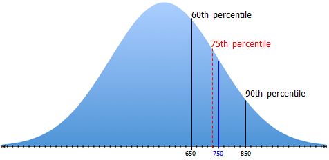
Official Explanation
You are given that the distribution of random variable X is normal and that the values 650 and 850 are at the 60th and 90th percentiles of the distribution, respectively.
Both of the values 650 and 850 are greater than the mean of the distribution. If you draw a rough sketch of the graph of the normal distribution, the sketch could look something like the one below. Note that it is not necessary to know the exact location of 650 and 850, just that both values are above the mean.
To say that the value 650 is at the 60th percentile of the distribution means, graphically, that 60 percent of the area between the normal curve and the horizontal axis lies to the left of the vertical line segment at 650. To say that 850 is at the 90th percentile of the distribution means that 90 percent of the area between the normal curve and the horizontal axis lies to the left of the vertical line segment at 850.
The value 750 is halfway between 650 and 850. However, because the curve is decreasing in that interval, the area between 650 and 750 is greater than the area between 750 and 850. Since the value at the 75th percentile should divide in half the area between the value at the 60th percentile (650) and the value at the 90th percentile (850), this value is closer to 650 than to 850. Thus you can conclude that Quantity A, the value at the 75th percentile of the distribution of X, is less than Quantity B. The correct answer is Choice B.
Attachment:
GMAT-Club-Forum-qt91ausw.jpeg [ 11.76 KiB | Viewed 6749 times ]