Events & Promotions
|
|

GMAT Club Daily Prep
Thank you for using the timer - this advanced tool can estimate your performance and suggest more practice questions. We have subscribed you to Daily Prep Questions via email.
Customized
for You
Track
Your Progress
Practice
Pays
Not interested in getting valuable practice questions and articles delivered to your email? No problem, unsubscribe here.
 Sep 27
01:30 AM EDT
-02:30 AM EDT
At one point, she believed GMAT wasn’t for her. After scoring 595, self-doubt crept in and she questioned her potential. But instead of quitting, she made the right strategic changes. The result? A remarkable comeback to 695. Check out how Saakshi did it. Sep 28
07:00 PM EDT
-10:00 PM EDT
Boost your GMAT score in less than one month in a live online class + 6 months access to TTP OnDemand video courses included! Class starts Mon, Tues, Wed, Thur, Fri Sept. 28, 2026 - Oct. 16, 2027, 7:00pm-10:00pm EST Sep 29
11:00 AM EDT
-01:00 PM EDT
" Description: Top scores are possible when you enroll in a powerful GMAT course, taught live online + 6 months access to TTP OnDemand video courses included! Class starts Tues/Thur Sept. 29, 2026 - Dec. 3, 2026, 11:00am-1:00pm EST Oct 01
02:00 AM EDT
-03:00 AM EDT
Tejas studied hard but kept repeating the same mistakes. After 3 attempts at 645, a focused 4-week strategy helped him identify and fix what was holding him back—leading to a 695 with just 12–15 hours of study per week. Oct 01
07:00 AM BST
-08:00 AM GMT
Welcome to the GMAT Club's Free Interview Prep Event for Top MBA Programs! Buy tickets - Virtual series that’s all set to equip you to -excel in your MBA interviews. Oct 03
01:00 PM EDT
-04:00 PM EDT
Top scores are possible when you enroll in a powerful GMAT course, taught live online + 6 months access to TTP OnDemand video courses included! Class starts Saturdays Oct. 3, 2026 - Dec. 26, 2026, 1:00pm-4:00pm EST Oct 04
08:00 PM PDT
-09:00 PM PDT
15 Full-length GMAT FE mocks with insightful analytics, weakness diagnosis, and video explanations!


 Updated on: 23 Sep 2026, 05:09

Dropdown 1: one-third
Dropdown 2: 1.8
Be sure to select an answer first to save it in the Error Log before revealing the correct answer (OA)!
Difficulty:
 45%
(medium)
45%
(medium)
Question Stats:
81% (03:04) correct 19%
(03:09)
wrong
based on 952
sessions
19%
(03:09)
wrong
based on 952
sessions
History
Date
Time
Result
Not Attempted Yet
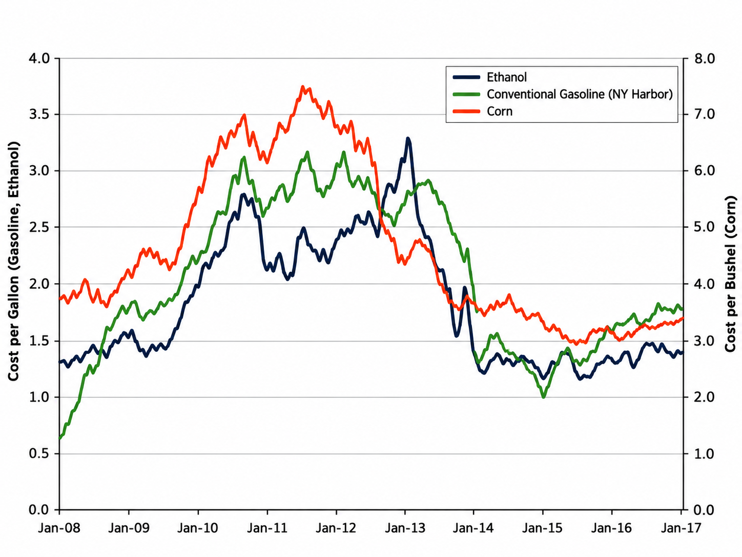
The graph shows the costs of ethanol, conventional gasoline (NY Harbor), and corn from January 2008 through January 2017. Ethanol and gasoline costs, in dollars per gallon, are shown on the left vertical axis, and corn costs, in dollars per bushel, are shown on the right vertical axis.
Select from each drop-down menu the option that creates the most accurate statement based on the information provided.
When the cost of corn was at its highest, the cost per gallon of ethanol was approximately of the cost per bushel of corn.
The range of costs for corn was approximately times the range of costs for gasoline.
ShowHide Answer
Official Answer
Dropdown 1: one-third
Dropdown 2: 1.8
Official Solution:
Drop-down 1:
The cost of corn, represented by the red line, was at its highest around the middle of 2011, reaching approximately $7.50 per bushel on the right vertical axis. At the same time, the cost of ethanol, represented by the black line, was approximately $2.50 per gallon on the left vertical axis.
Since \(\frac{2.5}{7.5}=\frac{1}{3}\), the cost per gallon of ethanol was approximately one-third of the cost per bushel of corn.
Drop-down 2:
The highest cost of corn was approximately $7.50 per bushel, while the lowest was approximately $3.00 per bushel, giving a range of approximately $4.50.
The highest cost of gasoline was approximately $3.10 per gallon, while the lowest was approximately $0.60 per gallon, giving a range of approximately $2.50.
Therefore, the range of costs for corn was approximately \(\frac{4.5}{2.5}=1.8\) times the range of costs for gasoline.
Correct answer:
Dropdown 1: "one-third "
Dropdown 2: "1.8 "
Bunuel
Drop-down 1:
The cost of corn, represented by the red line, was at its highest around the middle of 2011, reaching approximately $7.50 per bushel on the right vertical axis. At the same time, the cost of ethanol, represented by the black line, was approximately $2.50 per gallon on the left vertical axis.
Since \(\frac{2.5}{7.5}=\frac{1}{3}\), the cost per gallon of ethanol was approximately one-third of the cost per bushel of corn.
Drop-down 2:
The highest cost of corn was approximately $7.50 per bushel, while the lowest was approximately $3.00 per bushel, giving a range of approximately $4.50.
The highest cost of gasoline was approximately $3.10 per gallon, while the lowest was approximately $0.60 per gallon, giving a range of approximately $2.50.
Therefore, the range of costs for corn was approximately \(\frac{4.5}{2.5}=1.8\) times the range of costs for gasoline.
Correct answer:
Dropdown 1: "one-third "
Dropdown 2: "1.8 "
General Discussion

The # labels on the y axis for Cost per Bushel (corn) are very skewed, so I miscalculated the numbers. Are they supposed to be in that exact spot? Or are they also skewed? If they are supposed to be like that, in the GMAT when I see a problem where the numbers look off, should I go based off of the gap in the numbers, or the horizontal lines on the graph?