Events & Promotions
|
|

GMAT Club Daily Prep
Thank you for using the timer - this advanced tool can estimate your performance and suggest more practice questions. We have subscribed you to Daily Prep Questions via email.
Customized
for You
Track
Your Progress
Practice
Pays
Not interested in getting valuable practice questions and articles delivered to your email? No problem, unsubscribe here.
 Sep 02
12:30 AM EDT
-01:30 AM EDT
Thought your job leaves no time for GMAT prep? After multiple GMAT attempts and a demanding consulting job, Kshitij improved to 695 in under 2 months. Learn the mindset shifts, study strategy, and execution changes that made the breakthrough possible. Aug 27
10:00 AM EDT
-11:00 AM EDT
We’ve worked incredibly hard to build TTP into the best test prep experience possible, and it would mean a lot to us to win Newsweek’s 2026 Readers’ Choice Award for Best Test Prep. If TTP has helped you, we’d be incredibly grateful for your vote. Sep 02
08:00 PM PDT
-09:00 PM PDT
Video explanations + diagnosis of 10 weakest areas + 150+ short videos + study plan! Sep 03
01:30 AM EDT
-02:30 AM EDT
At one point, she believed GMAT wasn’t for her. After scoring 595, self-doubt crept in and she questioned her potential. But instead of quitting, she made the right strategic changes. The result? A remarkable comeback to 695. Check out how Saakshi did it. Sep 04
10:00 AM PDT
-11:00 AM PDT
What does test anxiety really look like on the GMAT? For many test takers, it does not look like a panic attack. Instead, it shows up as brain fog, rereading, negative comparisons, mental noise.... Sep 06
09:30 AM EDT
-12:30 PM EST
Top scores are possible when you enroll in a powerful EA course, taught live online + 6 months access to TTP OnDemand video courses included! Perfect class schedule and easy course access for working professionals. Class starts Sundays Sept. 6, 2026.- Sep 07
12:01 AM PDT
-11:59 PM PDT
On the 7th, GMAT Club Tests will be Free! Including all the Quizzes, Questions, and Tests. 12 AM - 11:59 PM PDT - Sep 09
07:00 AM PDT
-10:00 AM PDT
Meet AdComs and explore top Master’s programs - MiM, MiF, MSc, MSBA and more. - Application Fee Waivers - Free 1-Week of GMAT Club Tests: - Master's Application Toolkit - Grand Prize Giveaway  Sep 15
07:00 PM EDT
-09:00 PM EST
Elite scores are possible when you enroll in a powerful GMAT course, taught live online + 6 months access to TTP OnDemand video courses included! Class starts Tues/Thurs Sept. 15, 2026 - Nov. 15, 2027, 7:00pm-9:00pm EST Sep 21
08:00 PM EDT
-10:00 PM EDT
Boost your GMAT score in less than one month in a live online class + 6 months access to TTP OnDemand video courses included! Class starts Mon, Tues, Wed, Thur, Fri Sept. 21, 2026 - Oct. 9, 2027, 7:00pm-10:00pm EST

 05 Jul 2026, 10:10
Kudos
Bookmarks


Dropdown 1: inflation rate computation from other parameters
Dropdown 2: October
Be sure to select an answer first to save it in the Error Log before revealing the correct answer (OA)!
Difficulty:
 95%
(hard)
95%
(hard)
Question Stats:
14% (01:44) correct 86%
(02:31)
wrong
based on 314
sessions
86%
(02:31)
wrong
based on 314
sessions
History
Date
Time
Result
Not Attempted Yet
The graph shows \(52\) data points, one for each week, each data point indicating the mean deviation of inflation rate in India in that particular week. Mean deviation of inflation rate is measured as inflation rate for the week less annual mean inflation rate. The graph also shows line of best fit for the datapoints.
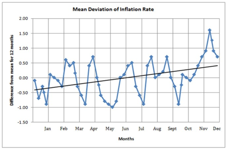
Based on the given information use the drop-down menus to most accurately complete the following statements:
1. Before concluding that mean inflation rate is rising, it would be helpful to see more comprehensive graph of same period that shows
2. The conclusion that mean inflation rate has risen over the year would be most weakened if set of measurement in are revised towards current line of best fit.

GMAT-Club-Forum-mrv5r4oe.png [ 216.29 KiB | Viewed 1144 times ]
Based on the given information use the drop-down menus to most accurately complete the following statements:
1. Before concluding that mean inflation rate is rising, it would be helpful to see more comprehensive graph of same period that shows
2. The conclusion that mean inflation rate has risen over the year would be most weakened if set of measurement in are revised towards current line of best fit.
Attachment:
GMAT-Club-Forum-mrv5r4oe.png [ 216.29 KiB | Viewed 1144 times ]
ShowHide Answer
Official Answer
Dropdown 1: inflation rate computation from other parameters
Dropdown 2: October
 05 Jul 2026, 23:23
Kudos
Bookmarks
Okay this one's sneaky because it looks like a "read the graph" question but it's actually testing whether you know when NOT to trust a graph. Classic Data Insights trap.
First blank: before you buy into "mean inflation rate is rising" just because the line of best fit slopes upward, ask yourself what that line is actually built from. The graph plots deviation from the annual mean, not raw inflation. If the way inflation itself gets computed shifts even a little week to week (different basket weighting, revised parameters, whatever), you'd get a rising-looking trend that has nothing to do with real inflation movement. So the answer here is "inflation rate computation from other parameters." You're not doubting the math on the graph, you're doubting whether the input feeding the graph is even stable.
Second blank, this is the one that got me thinking twice. The question asks which month's data, if revised toward the line of best fit, would most weaken the "rising" story. Look at where the actual dot sits furthest above the trend line late in the year. That's October, sitting well above where the fit line says it should be. That elevated point is doing a lot of the heavy lifting in making the second half of the year look higher than the first half. Pull it down to the line and a chunk of that "rise" evaporates.
I got this wrong the first time I saw a question like this because I was scanning left to right for the biggest visual dip instead of asking which point has the most leverage on the slope. Points near the ends of a data range always swing a trend line harder than points in the middle, worth remembering for any G&T question with a fit line.
Takeaway: when a DI question shows you a trend line, the trap isn't reading the graph wrong, it's trusting the line before you've questioned what's feeding it.
First blank: before you buy into "mean inflation rate is rising" just because the line of best fit slopes upward, ask yourself what that line is actually built from. The graph plots deviation from the annual mean, not raw inflation. If the way inflation itself gets computed shifts even a little week to week (different basket weighting, revised parameters, whatever), you'd get a rising-looking trend that has nothing to do with real inflation movement. So the answer here is "inflation rate computation from other parameters." You're not doubting the math on the graph, you're doubting whether the input feeding the graph is even stable.
Second blank, this is the one that got me thinking twice. The question asks which month's data, if revised toward the line of best fit, would most weaken the "rising" story. Look at where the actual dot sits furthest above the trend line late in the year. That's October, sitting well above where the fit line says it should be. That elevated point is doing a lot of the heavy lifting in making the second half of the year look higher than the first half. Pull it down to the line and a chunk of that "rise" evaporates.
I got this wrong the first time I saw a question like this because I was scanning left to right for the biggest visual dip instead of asking which point has the most leverage on the slope. Points near the ends of a data range always swing a trend line harder than points in the middle, worth remembering for any G&T question with a fit line.
Takeaway: when a DI question shows you a trend line, the trap isn't reading the graph wrong, it's trusting the line before you've questioned what's feeding it.
 06 Jul 2026, 22:32
Kudos
Bookmarks
Is the January month the unit preceding it in the graph? Also how does aligning Oct to trend line solve weaken the mean deviation increase?