|
|

GMAT Club Daily Prep
Thank you for using the timer - this advanced tool can estimate your performance and suggest more practice questions. We have subscribed you to Daily Prep Questions via email.
Customized
for You
Track
Your Progress
Practice
Pays
Not interested in getting valuable practice questions and articles delivered to your email? No problem, unsubscribe here.

Dropdown 1: Mar01-Mar15
Dropdown 2: 27%
Be sure to select an answer first to save it in the Error Log before revealing the correct answer (OA)!
Difficulty:
 95%
(hard)
95%
(hard)
Question Stats:
34% (02:19) correct 66%
(02:47)
wrong
based on 474
sessions
66%
(02:47)
wrong
based on 474
sessions
History
Date
Time
Result
Not Attempted Yet

Experts Global
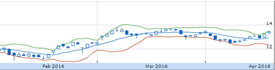
The graph illustrates changes in the price of the stock Technosoft over a period of time. The red and green lines are called Bollinger Bands, and they include the price range in which stock trades are most likely to occur based on a moving average. The blue line shows the moving average. The box plots show the common and extreme prices for sales of that stock on each trading day.
From the dropdown menus, select the options that create the most accurate statements based on the information provided.
The period of had the greatest price volatility.
If a person bought the stock at the lowest point in the duration under study and sold it at the highest in the same, the person earned a profit of approximately percentage on his investment, excluding the brokerage.
Archived Topic
Hi there,
This topic has been closed and archived due to inactivity or violation of community quality standards. No more replies are possible here.
Where to now? Join ongoing discussions on thousands of quality questions in our Graphs and Tables (G&T) Forum
Still interested in this question? Check out the "Best Topics" block below for a better discussion on this exact question, as well as several more related questions.
Thank you for understanding, and happy exploring!
ShowHide Answer
Official Answer
Dropdown 1: Mar01-Mar15
Dropdown 2: 27%

Kudos
Bookmarks
I. During the period of Mar 01-Mar 15, the Bollinger Bands have the largest deviation from the average for the longest period of time, indicating that price during this time were varying quite a lot, making them quite volatile.
Hence, Mar 01-Mar 15 is the correct answer choice.
II. Over the period, the lowest price was approximately $11 and the highest price was approximately $14. Hence, the maximum possible profit on investment is ($14-$11) / $11 =27% approximately.
Hence, 27% is the correct answer choice.
Hence, Mar 01-Mar 15 is the correct answer choice.
II. Over the period, the lowest price was approximately $11 and the highest price was approximately $14. Hence, the maximum possible profit on investment is ($14-$11) / $11 =27% approximately.
Hence, 27% is the correct answer choice.

Kudos
Bookmarks
For the second question, I used the following numbers:
Sale price=$13.75
Purchase price=$10.25
Profit=($3.50/10.25)×100=34%
Where did I go wrong in my reading of the chart? Thanks!
Posted from my mobile device
Sale price=$13.75
Purchase price=$10.25
Profit=($3.50/10.25)×100=34%
Where did I go wrong in my reading of the chart? Thanks!
Posted from my mobile device