Events & Promotions
|
|

GMAT Club Daily Prep
Thank you for using the timer - this advanced tool can estimate your performance and suggest more practice questions. We have subscribed you to Daily Prep Questions via email.
Customized
for You
Track
Your Progress
Practice
Pays
Not interested in getting valuable practice questions and articles delivered to your email? No problem, unsubscribe here.
- Nov 20
07:30 AM PST
-08:30 AM PST
Learn what truly sets the UC Riverside MBA apart and how it helps in your professional growth - Nov 22
11:00 AM IST
-01:00 PM IST
Do RC/MSR passages scare you? e-GMAT is conducting a masterclass to help you learn – Learn effective reading strategies Tackle difficult RC & MSR with confidence Excel in timed test environment - Nov 23
11:00 AM IST
-01:00 PM IST
Attend this free GMAT Algebra Webinar and learn how to master the most challenging Inequalities and Absolute Value problems with ease. - Nov 25
10:00 AM EST
-11:00 AM EST
Prefer video-based learning? The Target Test Prep OnDemand course is a one-of-a-kind video masterclass featuring 400 hours of lecture-style teaching by Scott Woodbury-Stewart, founder of Target Test Prep and one of the most accomplished GMAT instructors.
Kudos
Bookmarks
Dropdown 1: negative
Dropdown 2: 12
Be sure to select an answer first to save it in the Error Log before revealing the correct answer (OA)!
Difficulty:
 35%
(medium)
Question Stats:
70% (01:57) correct 30%
(02:05)
wrong
  based on 351
sessions
History
Date
Time
Result
Not Attempted Yet
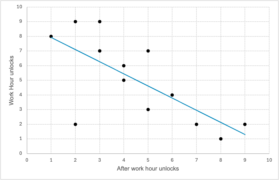
A team of behavioral scientists studied the screen time habits of 13 professionals over a 24-hour period. For each individual, the researchers recorded the number of times they unlocked their work phone during working hours (9:00 a.m. to 5:00 p.m.) and outside of working hours (5:00 p.m. to 9:00 a.m.). The scatterplot shows the results, with each point representing one participant. The horizontal axis shows after-hours phone unlocks; the vertical axis shows unlocks during work hours. A line of best fit is also shown.

The chart indicates correlation between after-hours and work-hours phone usage among participants.
Based on the chart, is the highest total number of phone unlocks (work + after hours) recorded for any single participant during the 24-hour period.

GMAT-Club-Forum-9tvuwwuu.png [ 29.49 KiB | Viewed 1880 times ]
The chart indicates correlation between after-hours and work-hours phone usage among participants.
Based on the chart, is the highest total number of phone unlocks (work + after hours) recorded for any single participant during the 24-hour period.
Attachment:
GMAT-Club-Forum-9tvuwwuu.png [ 29.49 KiB | Viewed 1880 times ]
ShowHide Answer
Official Answer
Dropdown 1: negative
Dropdown 2: 12
Kudos
Bookmarks
1) As indicated by the slope, correlation is Negative
2) Highest total number of phone unlocks= 9+3=12 or 7+5= 12
2) Highest total number of phone unlocks= 9+3=12 or 7+5= 12
Kudos
Bookmarks
Bunuel
Solution:
Dropdown 1: Type of Correlation
From the scatterplot:
- The points show a negative relationship: when nighttime activity increases, daytime activity tends to decrease.
- This is supported by the downward-sloping trendline.
Dropdown 2: Maximum Activity Count
We are asked for the maximum number of times any bird left its nest in the 24-hour period.
Each data point represents:
Total = (daytime departures) + (nighttime departures)
Calculate the maximum of all such totals from the graph. Approximate visually:
A few likely candidates:
- One point at (2, 9): Total = 11
- One at (3, 9): Total = 12
- One at (1, 8): Total = 9
- One at (8, 1): Total = 9
- One at (9, 1): Total = 10
- (3, 9) → 3 (night) + 9 (day) = 12


