Events & Promotions
|
|

GMAT Club Daily Prep
Thank you for using the timer - this advanced tool can estimate your performance and suggest more practice questions. We have subscribed you to Daily Prep Questions via email.
Customized
for You
Track
Your Progress
Practice
Pays
Not interested in getting valuable practice questions and articles delivered to your email? No problem, unsubscribe here.
 Jun 04
08:30 AM PDT
-09:30 AM PDT
For most test takers, Data Insights is the most challenging section on the GMAT, with test takers scoring several points lower on average on DI than on Quant or Verbal and completing the section with less time to spare. Jun 04
10:00 AM EDT
-10:30 AM EDT
Most MBA applicants treat the essay prompt as a question to answer. It isn't. The prompts at M7 and T10 programs are open-ended by design — watching what candidates choose to say when almost anything is fair game. That choice is a strategic decision, and May 29
10:00 AM IST
-11:00 PM IST
Start your journey with a fully customized action plan and work with a dedicated mentor to achieve a 735+ score.- Jun 03
07:30 AM PDT
-08:30 AM PDT
Getting into an M7 business school is not about creating one strong MBA application and sending it everywhere. Harvard, Stanford, Wharton, Chicago Booth, Kellogg, MIT Sloan, and Columbia are all elite MBA programs — but they do not evaluate applicants.... - Jun 03
08:30 AM PDT
-09:30 AM PDT
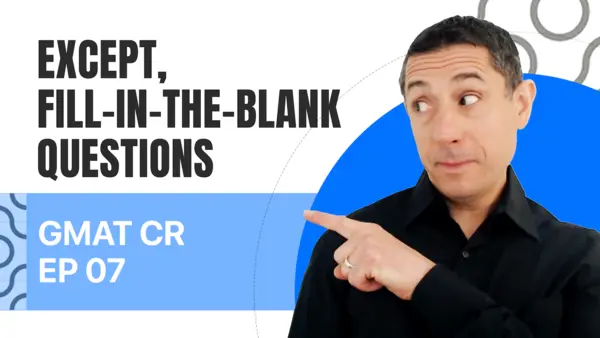
In Episode 7 of our GMAT Ninja CR series, we are rounding up the oddballs, the misfits, and the format-benders: EXCEPT, Fill-In-The-Blanks, and other unusual Critical Reasoning question types. When you see a question that ends with a literal blank line - Jun 03
10:00 AM PDT
-11:00 AM PDT
Short-answer questions are often the most overlooked part of MBA applications — but they can quietly become one of the strongest ways to differentiate yourself. In this video, we break down why short-answer prompts matter, and more....  Jun 03
11:00 AM EDT
-12:00 PM EDT
Free Webinar. Only 10 weeks until the Kellogg EMBA August deadline! Learn key steps for earning a large scholarship there. Presented by Dr. Shelle, a Harvard and Oxford graduate and EMBA expert. Jun 06
11:00 AM EDT
-12:00 PM EDT
. From MBA Admit.com and Dr. Shelle. The deadline for Wharton’s Executive MBA program is 4.5 months away! Learn to avoid 6 fatal mistakes that can SINK a Wharton Executive MBA application! Jun 06
11:00 AM PDT
-11:00 AM PDT
The old MBA recruiting playbook is dead. Here’s how top admits are getting ahead this summer. Jun 08
04:00 PM PDT
-05:00 PM PDT
Inquire for a free profile evaluation and guarantee statement for possible admits and scholarships! Jun 09
11:00 AM EDT
-12:00 PM EDT
Download the MBA Launchpad App, for FREE access to the largest MBA database - Data backed read on your profile - Identify gaps before you apply - Build a balanced school list - Track your deadlines - Mock interviews - Extensive content library- Jun 10
06:00 AM PDT
-06:15 PM PDT
Register for the GMAT Club Virtual MBA Spotlight Fair – the world’s premier event for serious MBA candidates. This is your chance to hear directly from Admissions Directors at nearly every Top 30 MBA program..  Jun 12
08:30 PM IST
-09:30 PM IST
Join us for a live Coffee Chat where we discuss how applicants from competitive backgrounds can differentiate themselves and build a stronger MBA application.


Kudos
Bookmarks
workout
Hi abhimahna
Any update on this request? I am seeing more and more decision tracker updates as posts

Kudos
Bookmarks
workout
Hi workout ,
This is how I see it. Do you see something different it?
Attachments
Screen Shot 2020-08-31 at 1.18.49 PM.png [ 83.39 KiB | Viewed 2569 times ]
Kudos
Bookmarks
abhimahna
I see the same as in your image. I see that the green "Admitted" is pushed off to the right and the entire post looks very different with no alignment