Events & Promotions
|
|

GMAT Club Daily Prep
Thank you for using the timer - this advanced tool can estimate your performance and suggest more practice questions. We have subscribed you to Daily Prep Questions via email.
Customized
for You
Track
Your Progress
Practice
Pays
Not interested in getting valuable practice questions and articles delivered to your email? No problem, unsubscribe here.
 Jun 10
06:00 AM PDT
-06:15 PM PDT
Register for the GMAT Club Virtual MBA Spotlight Fair – the world’s premier event for serious MBA candidates. This is your chance to hear directly from Admissions Directors at nearly every Top 30 MBA program..- Jun 10
10:00 AM PDT
-11:00 AM PDT
Scoring 715 on the GMAT Focus Edition requires more than just learning formulas, memorizing concepts, or solving hundreds of questions. In this episode, Nishant shares how he improved his GMAT preparation by focusing on application of concepts, and more.  Jun 11
11:00 AM EDT
-01:00 PM EDT
TTP GMAT OnDemand gives serious students 400+ hours of expert video instruction, the full TTP course, AI support, weekly office hours, and a 715+ score guarantee—all built for elite GMAT score improvement. Jun 22
07:30 PM EDT
-09:30 PM EDT
Master the GMAT with expert live instruction, a personalized study plan, and real-time support. Includes 40 hours of online classes plus 6 months of access to the TTP GMAT OnDemand video course. Class date: Mon/Wed June 22, 2026 →August 26, 2026

Kudos
Bookmarks

Dropdown 1: greater than
Dropdown 2: 2011
Be sure to select an answer first to save it in the Error Log before revealing the correct answer (OA)!
Difficulty:
 45%
(medium)
45%
(medium)
Question Stats:
68% (02:47) correct 32%
(02:48)
wrong
based on 3662
sessions
32%
(02:48)
wrong
based on 3662
sessions
History
Date
Time
Result
Not Attempted Yet
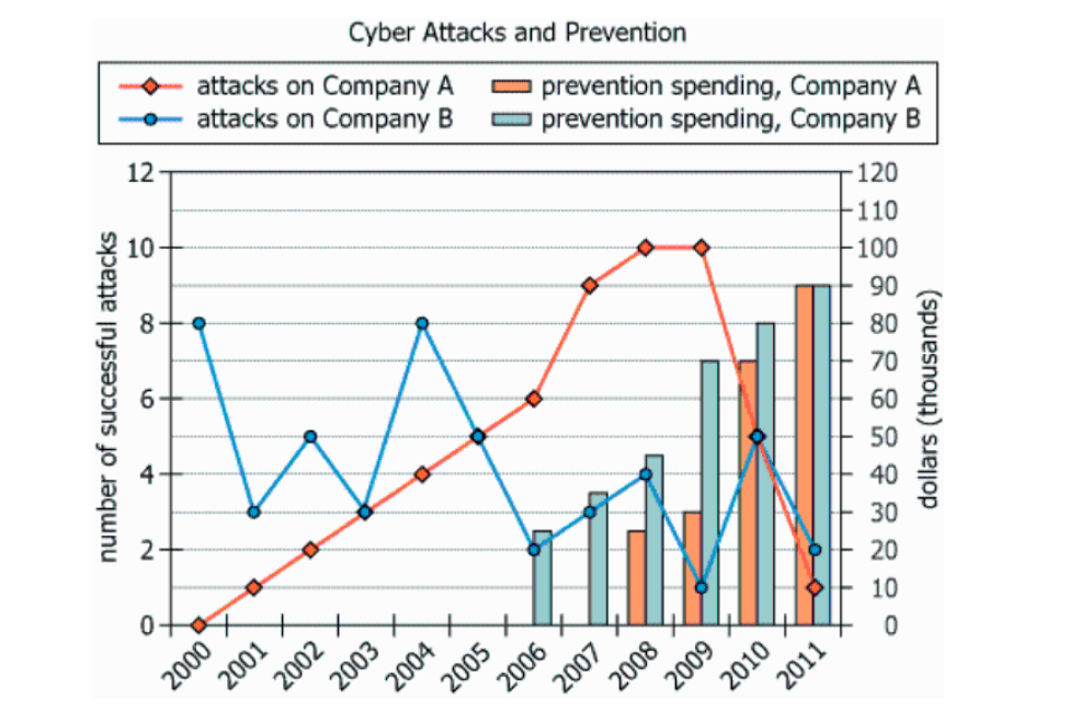
For the years 2000 to 2011, the graph shows for the number of successful cyber attacks that year on two companies, as well as the amount of money (in thousands of dollars) each company spent that year in prevention of cyber attacks. Neither company had experienced successful cyber attacks before the year 2000.
Use the drop-down menus to form the most accurate statements based on the given information.
From 2000 to 2011, the number of successful cyber attacks that Company A experienced was the number of successful cyber attacks that Company B experienced.
The only year where increased spending coincided with a decrease in successful cyber attacks (compared to the previous year) for both companies was .
ID: 101119
ShowHide Answer
Official Answer
Dropdown 1: greater than
Dropdown 2: 2011

Kudos
Bookmarks
1. We are first asked to compare the number of successful attacks on company A vs B.
2. To do this, we don't have to sum up all the attacks, but rather calculate the delta between A and B.

3. The graph tells us that the number of attacks on B is (+8+2+3+4-4-6-6-9+1) = -7 larger than for A. In other words, company A had more successful cyberattacks than company B.
4. Next, we are asked to find the year when both companies increased funding and the number of cyberattacks decreased.
5. Notice that funding only increases for both companies throughout the years.

6. The number of cyberattacks on A decreases only in years 2010 and 2011. The number of cyberattacks on B decreases only in years 2009 and 2011 (earlier years aren't important since funding was 0). So, our answer is 2011.

GraphCyberattack1.jpg [ 52.55 KiB | Viewed 14791 times ]

GraphCyberattack2.jpg [ 52.9 KiB | Viewed 14552 times ]
2. To do this, we don't have to sum up all the attacks, but rather calculate the delta between A and B.
3. The graph tells us that the number of attacks on B is (+8+2+3+4-4-6-6-9+1) = -7 larger than for A. In other words, company A had more successful cyberattacks than company B.
4. Next, we are asked to find the year when both companies increased funding and the number of cyberattacks decreased.
5. Notice that funding only increases for both companies throughout the years.
6. The number of cyberattacks on A decreases only in years 2010 and 2011. The number of cyberattacks on B decreases only in years 2009 and 2011 (earlier years aren't important since funding was 0). So, our answer is 2011.
Attachment:
GraphCyberattack1.jpg [ 52.55 KiB | Viewed 14791 times ]
Attachment:
GraphCyberattack2.jpg [ 52.9 KiB | Viewed 14552 times ]

Kudos
Bookmarks
Razara
Try adding the difference with -ve and +ve sign with reference to company A values; that way you have to add only once. If you get a +ve number means it is greater than the company B.
Hope it helps.


