Events & Promotions
|
|

GMAT Club Daily Prep
Thank you for using the timer - this advanced tool can estimate your performance and suggest more practice questions. We have subscribed you to Daily Prep Questions via email.
Customized
for You
Track
Your Progress
Practice
Pays
Not interested in getting valuable practice questions and articles delivered to your email? No problem, unsubscribe here.
 May 21
10:00 AM EDT
-11:59 PM EDT
Make the most of your break with the most realistic GMAT™ prep. Take up to $700 off select products. May 22
11:00 AM EDT
-11:59 PM EDT
Take 30% off all study plans with code PICNIC - Expires on Monday, May 25th May 25
12:01 AM PDT
-11:59 PM PDT
On the 25th, GMAT Club Tests will be Free! Including all the Quizzes, Questions, and Tests. 12 AM - 11:59 PM PST- Jun 10
06:00 AM PDT
-06:15 PM PDT
Register for the GMAT Club Virtual MBA Spotlight Fair – the world’s premier event for serious MBA candidates. This is your chance to hear directly from Admissions Directors at nearly every Top 30 MBA program..


Kudos
Bookmarks

Dropdown 1: 0.05
Dropdown 2: 0.35
Be sure to select an answer first to save it in the Error Log before revealing the correct answer (OA)!
Difficulty:
 35%
(medium)
35%
(medium)
Question Stats:
77% (02:20) correct 23%
(02:34)
wrong
based on 200
sessions
23%
(02:34)
wrong
based on 200
sessions
History
Date
Time
Result
Not Attempted Yet
For a small city, the graph represents the daily deviation, in minutes, of a commuter’s travel time from the expected commute time for each day in a 100-day period. Data is grouped into disjoint classes of deviations: for each value of T marked on the horizontal axis, the class centered at T includes all observed deviations greater than or equal to (T−1) minutes but less than (T+1) minutes. The height of each bar represents the number of deviations in the corresponding class. A given day’s commute is said to be x minutes shorter than normal if it is x minutes less than the left endpoint of the class centered at 0, and x minutes longer than normal if it is x minutes greater than the right endpoint of the class centered at 0.
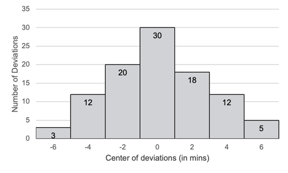
From each drop-down menu, select the option that creates the most accurate statement based on the information provided.
For a randomly selected day in this 100-day period, the probability that the commute time was at least 5 minutes longer than normal is , and the probability that the commute time was at least 1 minute longer than normal is .

GMAT-Club-Forum-6dgokq2c.png [ 23.44 KiB | Viewed 2164 times ]
From each drop-down menu, select the option that creates the most accurate statement based on the information provided.
For a randomly selected day in this 100-day period, the probability that the commute time was at least 5 minutes longer than normal is , and the probability that the commute time was at least 1 minute longer than normal is .
Attachment:
GMAT-Club-Forum-6dgokq2c.png [ 23.44 KiB | Viewed 2164 times ]
ShowHide Answer
Official Answer
Dropdown 1: 0.05
Dropdown 2: 0.35

Kudos
Bookmarks
Shouldn't the question say 100 day period instead of 90? really threw me off for a second there.
Kudos
Bookmarks
Bunuel
Solution:
Class centered at 0 includes deviations from -1 to +1 minutes.
1. Probability that commute time was at least 5 minutes longer than normal:
Corresponds to:
Class centered at 6 → 5 days
Total = 17 days
Probability = 5 / 100 = 5%
2. Probability that commute time was at least 1 minutes longer than normal:
Corresponds to:
Class centered at 2 → 18 days
Class centered at 4 → 12 days
Class centered at 6 → 5 days
Total = 18 + 12 + 5 = 35 days
Probability = 35 / 100 = 35%