Events & Promotions
|
|

GMAT Club Daily Prep
Thank you for using the timer - this advanced tool can estimate your performance and suggest more practice questions. We have subscribed you to Daily Prep Questions via email.
Customized
for You
Track
Your Progress
Practice
Pays
Not interested in getting valuable practice questions and articles delivered to your email? No problem, unsubscribe here.
 May 19
12:00 PM PDT
-01:00 PM PDT
Scoring 329 on the GRE is not always about using more books, more courses, or a longer study plan. In this episode of GRE Success Talks, Ashutosh shares his GRE preparation strategy, study plan, and test-day experience, explaining how he kept his prep.... May 20
08:00 AM PDT
-08:30 AM PDT
What’s in it for you- Live Profile Evaluation Chat Session with Jenifer Turtschanow, CEO, ARINGO. Come with your details prepared and ARINGO will share insights! Pre-MBA Role/Industry, YOE, Exam Score, C/GPA, ECs Post-MBA Role/ Industry & School List. May 15
01:00 PM IST
-11:00 AM IST
Start your journey with a fully customized action plan and work with a dedicated mentor to achieve a 735+ score.- Jun 10
06:00 AM PDT
-06:15 PM PDT
Register for the GMAT Club Virtual MBA Spotlight Fair – the world’s premier event for serious MBA candidates. This is your chance to hear directly from Admissions Directors at nearly every Top 30 MBA program..


Dropdown 1: 25% more
Dropdown 2: Between 2005 and 2006
Be sure to select an answer first to save it in the Error Log before revealing the correct answer (OA)!
Difficulty:
 95%
(hard)
95%
(hard)
Question Stats:
51% (03:11) correct 49%
(02:58)
wrong
based on 455
sessions
49%
(02:58)
wrong
based on 455
sessions
History
Date
Time
Result
Not Attempted Yet
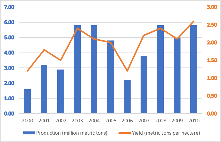
The graph above shows wheat production in million metric tons (blue bars) and yield in metric tons per hectare (orange line) for a country from 2000 through 2010.
From each drop-down menu, select the option that creates the most accurate statement based on the information provided.
The total land under wheat in 2003 was approximately than that in 2002.
The largest percentage drop in yield per hectare was .
Attachment:
23.jpg [ 87.44 KiB | Viewed 5311 times ]
ShowHide Answer
Official Answer
Dropdown 1: 25% more
Dropdown 2: Between 2005 and 2006
Bunuel
Official Solution:
Drop-down 1:
To calculate the land area under wheat, we divide wheat production by yield per hectare, since \(\text{land}=\frac{\text{production}}{\text{yield}}\). For 2002, this is approximately \(\frac{2.9}{1.5} \approx 1.9\), and for 2003, it is approximately \(\frac{5.8}{2.4} \approx 2.4\). The increase from 1.9 to 2.4 is about 25%, so the land under wheat in 2003 was approximately 25% more than that in 2002.
Drop-down 2:
Largest percentage drop means the largest proportional decrease from one year to the next, that is, (previous yield - new yield)/(previous yield). The biggest proportional decline occurs between 2005 and 2006, where yield falls from a little over 2 to about 1.2, which is the largest relative drop.
Correct answer:
Dropdown 1: "25% more"
Dropdown 2: "Between 2005 and 2006"


Kudos
Bookmarks
Bunuel - I got confused by the markings the right hand side's y-axis. They are not equally spaced. This prevented me from extracting numbers in time.
Any thought on such discrepancies and how to look at them?
Also - the approximations you've done(wrt calculations), are you approximating numbers in head using the concepts from NT or using calculator?
Calc will take more time but wouldn't want to go too far in approximations.
Any way I can get better at approximations?
Thanks.