Events & Promotions
|
|

GMAT Club Daily Prep
Thank you for using the timer - this advanced tool can estimate your performance and suggest more practice questions. We have subscribed you to Daily Prep Questions via email.
Customized
for You
Track
Your Progress
Practice
Pays
Not interested in getting valuable practice questions and articles delivered to your email? No problem, unsubscribe here.
 Jun 04
08:30 AM PDT
-09:30 AM PDT
For most test takers, Data Insights is the most challenging section on the GMAT, with test takers scoring several points lower on average on DI than on Quant or Verbal and completing the section with less time to spare. Jun 08
08:00 PM EDT
-10:00 PM EDT
A powerful GMAT course taught live online + 6 months of access to TTP OnDemand GMAT Masterclass included! Class begins June 8, 2026- Jun 10
06:00 AM PDT
-06:15 PM PDT
Register for the GMAT Club Virtual MBA Spotlight Fair – the world’s premier event for serious MBA candidates. This is your chance to hear directly from Admissions Directors at nearly every Top 30 MBA program..  Jun 11
11:00 AM EDT
-01:00 PM EDT
TTP GMAT OnDemand gives serious students 400+ hours of expert video instruction, the full TTP course, AI support, weekly office hours, and a 715+ score guarantee—all built for elite GMAT score improvement.


Dropdown 1: ND
Dropdown 2: 5
Be sure to select an answer first to save it in the Error Log before revealing the correct answer (OA)!
Difficulty:
 95%
(hard)
95%
(hard)
Question Stats:
28% (03:00) correct 72%
(03:15)
wrong
based on 335
sessions
72%
(03:15)
wrong
based on 335
sessions
History
Date
Time
Result
Not Attempted Yet
The graph shows state-level changes in corn and soybean acreage in the United States from January 2006 through December 2008.
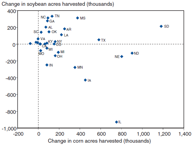
Select from each drop-down menu the option that creates the most accurate statement based on the information provided.
The state that experienced the second largest increase in combined corn and soybean acreage during the period shown in the graph was .
The range of change in combined corn and soybean acreage among the states during the period shown in the graph was approximately times the largest increase in soybean acreage of any state during the same period.

4.jpg [ 61.72 KiB | Viewed 8570 times ]
Select from each drop-down menu the option that creates the most accurate statement based on the information provided.
The state that experienced the second largest increase in combined corn and soybean acreage during the period shown in the graph was .
The range of change in combined corn and soybean acreage among the states during the period shown in the graph was approximately times the largest increase in soybean acreage of any state during the same period.
Attachment:
4.jpg [ 61.72 KiB | Viewed 8570 times ]
ShowHide Answer
Official Answer
Dropdown 1: ND
Dropdown 2: 5
Kudos
Bookmarks
Bunuel

Official Solution:
Drop-down 1:
First, notice that the \(x\)-axis (corn acreage) ranges from -200 to 1,400, while the \(y\)-axis (soybean acreage) ranges from -1,000 to 4,000. Clearly, the state that experienced the largest increase in combined corn and soybean acreage was South Dakota (SD), with a total increase of approximately 1,200 + 200 = 1,400. The second largest increase appears to be in North Dakota (ND), with a net increase of approximately 900 + (-100) = 800.
Drop-down 2:
The range of change in combined corn and soybean acreage can be found by subtracting the largest decrease from the largest increase. The largest increase, as calculated above, was for South Dakota (SD) at 1,400. The largest decrease must be for Illinois (IL), at 750 + (-950) = -200. Thus, the range of change is 1,400 - (-200) = 1,600.
The largest increase in soybean acreage was for Tennessee (TN), at approximately 350.
Therefore, the range of 1,600 is approximately \(\frac{1,600}{350} \approx 5\) times the largest increase in soybean acreage of 350.
Correct answer:
Dropdown 1: "ND"
Dropdown 2: "5"

Kudos
Bookmarks
Automated notice from GMAT Club BumpBot:
A member just gave Kudos to this thread, showing it’s still useful. I’ve bumped it to the top so more people can benefit. Feel free to add your own questions or solutions.
This post was generated automatically.
A member just gave Kudos to this thread, showing it’s still useful. I’ve bumped it to the top so more people can benefit. Feel free to add your own questions or solutions.
This post was generated automatically.