Events & Promotions
|
|

GMAT Club Daily Prep
Thank you for using the timer - this advanced tool can estimate your performance and suggest more practice questions. We have subscribed you to Daily Prep Questions via email.
Customized
for You
Track
Your Progress
Practice
Pays
Not interested in getting valuable practice questions and articles delivered to your email? No problem, unsubscribe here.
 May 20
08:00 AM PDT
-08:30 AM PDT
What’s in it for you- Live Profile Evaluation Chat Session with Jenifer Turtschanow, CEO, ARINGO. Come with your details prepared and ARINGO will share insights! Pre-MBA Role/Industry, YOE, Exam Score, C/GPA, ECs Post-MBA Role/ Industry & School List. Jun 10
06:00 AM PDT
-06:15 PM PDT
Register for the GMAT Club Virtual MBA Spotlight Fair – the world’s premier event for serious MBA candidates. This is your chance to hear directly from Admissions Directors at nearly every Top 30 MBA program..


Dropdown 1: exercise
Dropdown 2: caffeine
Be sure to select an answer first to save it in the Error Log before revealing the correct answer (OA)!
Difficulty:
 5%
(low)
5%
(low)
Question Stats:
83% (01:28) correct 17%
(01:41)
wrong
based on 1930
sessions
17%
(01:41)
wrong
based on 1930
sessions
History
Date
Time
Result
Not Attempted Yet
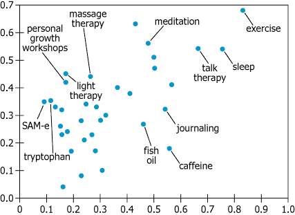
The graphic displays results of an Internet survey on the effectiveness and popularity of various treatments for depression. The scale on the horizontal axis represents popularity, P, defined as the fraction of all respondents who tried the treatment; the scale on the vertical axis represents effectiveness, F, defined as the fraction of all respondents who considered a given treatment to be effective.
On the basis of the information provided, select from each of the drop-down menus the option that creates the most accurate statement.
The treatment that was both the most effective and used by the greatest number of people is .
Among the labeled treatments tried by more than half of the respondents, was the least effective.
ID: 100313

111.jpg [ 37.4 KiB | Viewed 25671 times ]
Attachment:
111.jpg [ 37.4 KiB | Viewed 25671 times ]
ShowHide Answer
Official Answer
Dropdown 1: exercise
Dropdown 2: caffeine
Every tricky question should trigger a follow up quiz.
Build that habit with
GMAT Club Forum Quiz →.


Kudos
Bookmarks
Official Explanation
The scale on the graph's vertical axis represents effectiveness, defined as the fraction of respondents who considered a given treatment effective, with greater fractions higher on the axis. Therefore, dots higher in the graph represent more effective treatments. The scale on the horizontal axis represents the fraction of respondents who have tried a given treatment, with greater fractions farther to the right. Therefore, dots farther to the right in the graph represent treatments that more people have tried. The dot representing exercise is both the highest and the farthest to the right, indicating that exercise is both the most effective treatment and the one the most people have tried.
The correct answer is exercise.
As discussed in the analysis above, dots higher in the graph represent more effective treatments, and dots farther to the right represent treatments that more people have tried. The treatments that more than half the respondents have tried are those represented by dots to the right of the mark at 0.5 on the horizontal axis. Among those dots, the one labeled "caffeine" is lowest, indicating that caffeine is the least effective treatment that more than half the respondents have tried.
The correct answer is caffeine.

Kudos
Bookmarks
1)C,exercise since it is at the topmost section of graph in terms of the vertical axis (effectiveness fraction) and in the rightmost side in terms of horizontal axis.(fraction who tried the option)
2) Caffeine,since it is >0.5 at the horizontal axis
Posted from my mobile device
2) Caffeine,since it is >0.5 at the horizontal axis
Posted from my mobile device