Events & Promotions
|
|

GMAT Club Daily Prep
Thank you for using the timer - this advanced tool can estimate your performance and suggest more practice questions. We have subscribed you to Daily Prep Questions via email.
Customized
for You
Track
Your Progress
Practice
Pays
Not interested in getting valuable practice questions and articles delivered to your email? No problem, unsubscribe here.
 Jun 04
01:00 AM EDT
-02:00 AM EDT
Learn how Keshav, a Chartered Accountant, scored an impressive 705 on GMAT in just 30 days with GMATWhiz's expert guidance. In this video, he shares preparation tips and strategies that worked for him, including the mock, time management, and more. Jun 04
08:30 AM PDT
-09:30 AM PDT
For most test takers, Data Insights is the most challenging section on the GMAT, with test takers scoring several points lower on average on DI than on Quant or Verbal and completing the section with less time to spare. Jun 06
12:30 AM EDT
-01:30 AM EDT
Struggling to find the right strategies to score a 99 %ile on GMAT Focus? Riya (GMAT 715) boosted her score by 100-points in just 15 days! Discover how the right mentorship, tailored strategies, and an unwavering mindset can transform your GMAT prep. Jun 08
03:00 PM PDT
-04:00 PM PDT
15 Full-length GMAT FE mocks with insightful analytics, weakness diagnosis, and video explanations!- Jun 10
06:00 AM PDT
-06:15 PM PDT
Register for the GMAT Club Virtual MBA Spotlight Fair – the world’s premier event for serious MBA candidates. This is your chance to hear directly from Admissions Directors at nearly every Top 30 MBA program..

abcsayali
Joined: 12 Oct 2022
Last visit: 12 Jul 2025
Posts: 52
Given Kudos: 52
Location: India
Schools: Ross '27 (D) Anderson '27 (A$) HBS '27 (D) Tuck '27 (WL) Booth '27 (D) Stanford '27 (II) Kellog '27 (I) Fuqua '27 (WL) Johnson '27 (II) Tepper '27 (WL)
GMAT Focus 1: 705 Q90 V83 DI82 
GRE 1: Q166 V150
Schools: Ross '27 (D) Anderson '27 (A$) HBS '27 (D) Tuck '27 (WL) Booth '27 (D) Stanford '27 (II) Kellog '27 (I) Fuqua '27 (WL) Johnson '27 (II) Tepper '27 (WL)
GMAT Focus 1: 705 Q90 V83 DI82
GRE 1: Q166 V150
Posts: 52
Kudos
Bookmarks

Dropdown 1: all
Dropdown 2: all
Be sure to select an answer first to save it in the Error Log before revealing the correct answer (OA)!
Difficulty:
 35%
(medium)
35%
(medium)
Question Stats:
73% (02:15) correct 27%
(02:23)
wrong
based on 1532
sessions
27%
(02:23)
wrong
based on 1532
sessions
History
Date
Time
Result
Not Attempted Yet
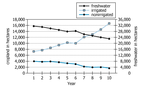
For each of 10 consecutive years (Year 1 through Year 10), the graph shows a certain region's irrigated crop land in hectares (left scale), non irrigated crop plant area in hectares (left scale) and freshwater area in hectares (right scale).
From each drop-down menu, select the option that creates the most accurate statement based on the information given.
For the 10 years shown in the graph for this reason, the number of hectares of freshwater exceeded the number of hectares of irrigated crop land in of the years.
For the 10 years shown in the graph for this region, the number of hectares of irrigated crop land exceeded the number of hectares of non irrigated crop land in of the years.

GMAT-Club-Forum-lo12dsuf.png [ 23.78 KiB | Viewed 5314 times ]
For each of 10 consecutive years (Year 1 through Year 10), the graph shows a certain region's irrigated crop land in hectares (left scale), non irrigated crop plant area in hectares (left scale) and freshwater area in hectares (right scale).
From each drop-down menu, select the option that creates the most accurate statement based on the information given.
For the 10 years shown in the graph for this reason, the number of hectares of freshwater exceeded the number of hectares of irrigated crop land in of the years.
For the 10 years shown in the graph for this region, the number of hectares of irrigated crop land exceeded the number of hectares of non irrigated crop land in of the years.
Attachment:
GMAT-Club-Forum-lo12dsuf.png [ 23.78 KiB | Viewed 5314 times ]
ShowHide Answer
Official Answer
Dropdown 1: all
Dropdown 2: all
Pro tip:
Combine official questions for familiarity with GMAT Club Tests for analytics and tougher Focus-level practice so the real exam feels manageable.
Explore →


Kudos
Bookmarks
abcsayali
Both are all.
for first just look at the minimum value of freshwater is somewhere around the middle of 20k-24k which is way higher than the scale of cropland hectors.
and second is straight forward.
Attachment:
GMAT-Club-Forum-x5wr7ixv.png [ 23.78 KiB | Viewed 5258 times ]

Kudos
Bookmarks
1. The question compares the area of the croplands and freshwater. It is key to note that the area for freshwater is shown on the right side of the graph instead of the left.
2. For the first part, across 10 years, freshwater was at least 20000 hectares and irrigated crop land was no more than 18000. This means that freshwater exceeded irrigated crop land for all 10 years.
3. For the second part, across 10 years, irrigated crop land was at least 6000 hectares and nonirrigated crop land was no more than 4000. This means that irrigated crop land exceeded nonirrigated crop land for all 10 years.
4. Our answer will be: D1 - all and D2 - all.