|
|

GMAT Club Daily Prep
Thank you for using the timer - this advanced tool can estimate your performance and suggest more practice questions. We have subscribed you to Daily Prep Questions via email.
Customized
for You
Track
Your Progress
Practice
Pays
Not interested in getting valuable practice questions and articles delivered to your email? No problem, unsubscribe here.
Kudos
Bookmarks
Dropdown 1: 10
Dropdown 2: greater than
Be sure to select an answer first to save it in the Error Log before revealing the correct answer (OA)!
Difficulty:
 25%
(medium)
Question Stats:
78% (02:12) correct 22%
(02:27)
wrong
  based on 742
sessions
History
Date
Time
Result
Not Attempted Yet
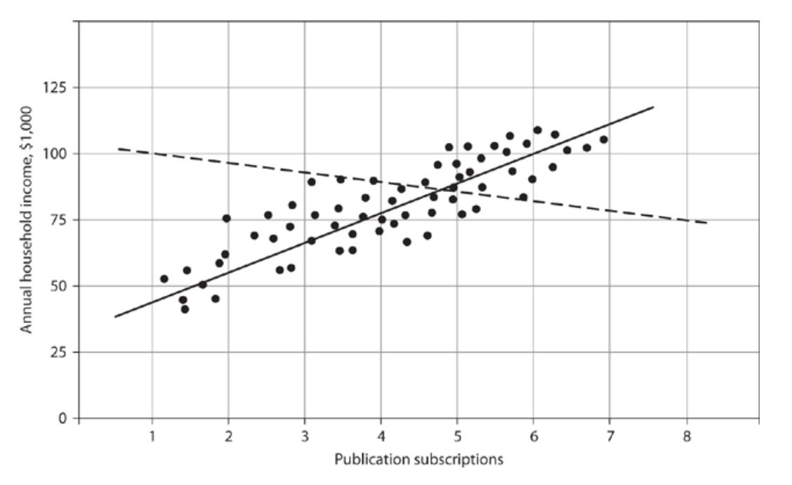
The following graph is a scatter plot with 64 points, each representing the number of publication subscriptions per month received by 64 households in a focus group and the corresponding annual income for each household. The annual income, measured in thousands of dollars, was reported for the tax year immediately before the focus group was held. The solid line is the regression line, and the dashed line is the line through the points (1, $100,000) and (8, $75,000). Select the best answer to fill in the blanks for each of the following statements, based on the data shown in the graph.

5.jpg [ 76.15 KiB | Viewed 6737 times ]
The number of households receiving more than 6 subscriptions a month is closest to % of 64.
The slope of the regression line is the slope of the dashed line.
Attachment:
5.jpg [ 76.15 KiB | Viewed 6737 times ]
The number of households receiving more than 6 subscriptions a month is closest to % of 64.
The slope of the regression line is the slope of the dashed line.
Show SpoilerAdditional Question
The relationship between the number of subscriptions and annual income is ________.
A. negative
B. zero
C. positive
Answer: C
A. negative
B. zero
C. positive
Answer: C
Data Insights (DI) Butler 2023-24 [Question #10, Date: Oct-03-2023] [Click here for Details]
ShowHide Answer
Official Answer
Dropdown 1: 10
Dropdown 2: greater than
Kudos
Bookmarks
@Sajjid1994 can you please provide the official explanation for the qs, also for the bonus hidden qs


