Events & Promotions
|
|

GMAT Club Daily Prep
Thank you for using the timer - this advanced tool can estimate your performance and suggest more practice questions. We have subscribed you to Daily Prep Questions via email.
Customized
for You
Track
Your Progress
Practice
Pays
Not interested in getting valuable practice questions and articles delivered to your email? No problem, unsubscribe here.
 Sep 26
06:00 PM PDT
-07:00 PM PDT
Free- full-length test + 15 concept videos + 150+ short videos + study plan! Sep 27
01:30 AM EDT
-02:30 AM EDT
At one point, she believed GMAT wasn’t for her. After scoring 595, self-doubt crept in and she questioned her potential. But instead of quitting, she made the right strategic changes. The result? A remarkable comeback to 695. Check out how Saakshi did it. Sep 26
12:30 AM EDT
-01:30 AM EDT
Struggling to find the right strategies to score a 99 %ile on GMAT Focus? Riya (GMAT 715) boosted her score by 100-points in just 15 days! Discover how the right mentorship, tailored strategies, and an unwavering mindset can transform your GMAT prep. Sep 28
07:00 PM EDT
-10:00 PM EDT
Boost your GMAT score in less than one month in a live online class + 6 months access to TTP OnDemand video courses included! Class starts Mon, Tues, Wed, Thur, Fri Sept. 28, 2026 - Oct. 16, 2027, 7:00pm-10:00pm EST Sep 29
11:00 AM EDT
-01:00 PM EDT
" Description: Top scores are possible when you enroll in a powerful GMAT course, taught live online + 6 months access to TTP OnDemand video courses included! Class starts Tues/Thur Sept. 29, 2026 - Dec. 3, 2026, 11:00am-1:00pm EST Oct 01
07:00 AM BST
-08:00 AM GMT
Welcome to the GMAT Club's Free Interview Prep Event for Top MBA Programs! Buy tickets - Virtual series that’s all set to equip you to -excel in your MBA interviews. Oct 03
01:00 PM EDT
-04:00 PM EDT
Top scores are possible when you enroll in a powerful GMAT course, taught live online + 6 months access to TTP OnDemand video courses included! Class starts Saturdays Oct. 3, 2026 - Dec. 26, 2026, 1:00pm-4:00pm EST

 14 Mar 2024, 06:35
Kudos
Bookmarks


Dropdown 1: less than
Dropdown 2: greater than
Be sure to select an answer first to save it in the Error Log before revealing the correct answer (OA)!
Difficulty:
 5%
(low)
5%
(low)
Question Stats:
88% (01:43) correct 12%
(01:43)
wrong
based on 2289
sessions
12%
(01:43)
wrong
based on 2289
sessions
History
Date
Time
Result
Not Attempted Yet
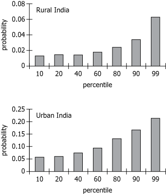
The two graphs show the probability of having moved (changed residence) within the past 10 years by percentiles of per capita consumption for individuals in rural and urban India. Note that the probability scales on the two graphs are different.
Use the drop-down menus to create statements that are consistent with the information presented.
For individuals at the 99th percentile of the per capita consumption distribution, the probability of having moved within the past 10 years for rural India is that for urban India.
The range of the probability of having moved within the past 10 years for urban India is that for rural India.
The two graphs show the probability of having moved (changed residence) within the past 10 years by percentiles of per capita consumption for individuals in rural and urban India. Note that the probability scales on the two graphs are different.
Use the drop-down menus to create statements that are consistent with the information presented.
For individuals at the 99th percentile of the per capita consumption distribution, the probability of having moved within the past 10 years for rural India is that for urban India.
The range of the probability of having moved within the past 10 years for urban India is that for rural India.
ID: 700156
ShowHide Answer
Official Answer
Dropdown 1: less than
Dropdown 2: greater than
Solving this question helps.
Taking a timed set of similar questions in
GMAT Club Forum Quiz →
is even better.
 03 Apr 2024, 22:19
Kudos
Bookmarks
gmatt1476
The graphs show the probability of moving of different sections of people in rural and urban India. The individuals have been divided into 7 sections (10th percentile of PCC, 20th percentile of PCC etc) and their probabilities are given.
So in Urban India, probability of moving is 0.06 for '10th percentile of PCC individuals.' (for this group). For 99th percentile of PCC group, it is about 0.2 etc.
For individuals at the 99th percentile of the per capita consumption distribution, the probability of having moved within the past 10 years for rural India is ____ that for urban India.
For rural India, at the '99th percentile of PCC' probability of moving is about 0.06.
For urban India, at the '99th percentile of PCC' probability of moving is about 0.2.
Hence for rural India, it is less.
ANSWER - less than
The range of the probability of having moved within the past 10 years for urban India is ____ that for rural India.
The range for urban India is about 0.2 - 0.06 = .14
The range for rural India is about .07 - .015 = .055
The range for urban India is much greater.
ANSWER - greater than
 20 Apr 2024, 06:49
Kudos
Bookmarks
How can the range be defined here, if we do not know the probability of 0%ile and 100%ile person in those regions?