Events & Promotions
| Last visit was: 02 Sep 2026, 11:15 |
It is currently 02 Sep 2026, 11:15 |
|
|

GMAT Club Daily Prep
Thank you for using the timer - this advanced tool can estimate your performance and suggest more practice questions. We have subscribed you to Daily Prep Questions via email.
Customized
for You
Track
Your Progress
Practice
Pays
Not interested in getting valuable practice questions and articles delivered to your email? No problem, unsubscribe here.
 Sep 07
12:01 AM PDT
-11:59 PM PDT
On the 7th, GMAT Club Tests will be Free! Including all the Quizzes, Questions, and Tests. 12 AM - 11:59 PM PDT- Sep 09
07:00 AM PDT
-10:00 AM PDT
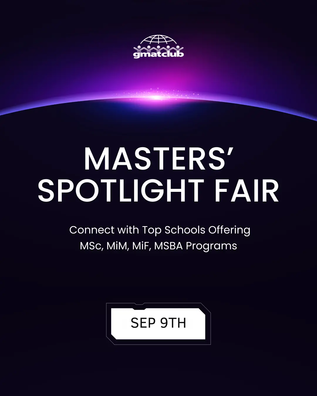
Meet AdComs and explore top Master’s programs - MiM, MiF, MSc, MSBA and more. - Application Fee Waivers - Free 1-Week of GMAT Club Tests: - Master's Application Toolkit - Grand Prize Giveaway

 06 Feb 2008, 00:14
Kudos
Bookmarks
It seems we have one more. Welcome prettypleaseGSB.
adcxaway - Submitted 01/08 Invited to interview! WOOHOOO!
bherronp - Submitted 12/30 Invited to interview
bsd_lover - Submitted 01/06 Invited to interview
nervousgmat - Submitted 12/31 Invited to interview
vchhaochharia - Submitted 12/25 Invited to interview
CerealsMBA - Submitted 01/09 Invited to interview
JDMBA - submitted, Invited to interview
ncprasad - Submitted 01/09, Invited to interview
sudden - submitted 1/8, Invited to interview
tsaditya - Submitted 01/08 Invited to Interview
wallspotter - submitted -01/09, Invited to interview
max125 - Submitted 01/08, Invited to interview
nupurgupt - Submitted 01/09, Invited to interview
clarksdv2 - Invited to interview
nick_sun - Submitted 01/09, Invited to interview
KingKREEP - Submitted 01/09, Invited to interview, Muhahaha! The game continues...
KK Iyer - Submitted 01/05, Invited to Interview (01/30)
Dosa_don - Submitted 01/09
hsampath - Submitted 01/08
mNeo - Submitted 01/09
pandeyrav - Submitted 01/09
robinantony - Submitted 01/09
trojan812 - Submitted 01/07
bkk145 - Submitted 01/09
helg - Submitted 01/09
gregspirited - Submitted 01/09
Audio - Submitted 01/09
ryguy904 - submitted 01/09
Poochandi - Submitted 01/09
vishalsuri
svrider - Submitted 01/09
saurabh357 - submitted 01/09
swedenr09 - submitted 1/9
ujjib - submitted 1/9
nyrberg - Submitted 01/09
Prodigy- Submitted 01/08
prettypleaseGSB
adcxaway - Submitted 01/08 Invited to interview! WOOHOOO!
bherronp - Submitted 12/30 Invited to interview
bsd_lover - Submitted 01/06 Invited to interview
nervousgmat - Submitted 12/31 Invited to interview
vchhaochharia - Submitted 12/25 Invited to interview
CerealsMBA - Submitted 01/09 Invited to interview
JDMBA - submitted, Invited to interview
ncprasad - Submitted 01/09, Invited to interview
sudden - submitted 1/8, Invited to interview
tsaditya - Submitted 01/08 Invited to Interview
wallspotter - submitted -01/09, Invited to interview
max125 - Submitted 01/08, Invited to interview
nupurgupt - Submitted 01/09, Invited to interview
clarksdv2 - Invited to interview
nick_sun - Submitted 01/09, Invited to interview
KingKREEP - Submitted 01/09, Invited to interview, Muhahaha! The game continues...
KK Iyer - Submitted 01/05, Invited to Interview (01/30)
Dosa_don - Submitted 01/09
hsampath - Submitted 01/08
mNeo - Submitted 01/09
pandeyrav - Submitted 01/09
robinantony - Submitted 01/09
trojan812 - Submitted 01/07
bkk145 - Submitted 01/09
helg - Submitted 01/09
gregspirited - Submitted 01/09
Audio - Submitted 01/09
ryguy904 - submitted 01/09
Poochandi - Submitted 01/09
vishalsuri
svrider - Submitted 01/09
saurabh357 - submitted 01/09
swedenr09 - submitted 1/9
ujjib - submitted 1/9
nyrberg - Submitted 01/09
Prodigy- Submitted 01/08
prettypleaseGSB
 06 Feb 2008, 00:31
Kudos
Bookmarks
I'm feeling stressed. So I organized it alphabetically...
37 applicants
17 interviews
46%
adcxaway - Submitted 01/08 Invited to interview! WOOHOOO!
bherronp - Submitted 12/30 Invited to interview
bsd_lover - Submitted 01/06 Invited to interview
CerealsMBA - Submitted 01/09 Invited to interview
clarksdv2 - Invited to interview
JDMBA - submitted, Invited to interview
KingKREEP - Submitted 01/09, Invited to interview, Muhahaha! The game continues...
KK Iyer - Submitted 01/05, Invited to Interview (01/30)
ncprasad - Submitted 01/09, Invited to interview
nervousgmat - Submitted 12/31 Invited to interview
nick_sun - Submitted 01/09, Invited to interview
nupurgupt - Submitted 01/09, Invited to interview
max125 - Submitted 01/08, Invited to interview
sudden - submitted 1/8, Invited to interview
tsaditya - Submitted 01/08 Invited to Interview
vchhaochharia - Submitted 12/25 Invited to interview
wallspotter - submitted -01/09, Invited to interview
Audio - Submitted 01/09
bkk145 - Submitted 01/09
Dosa_don - Submitted 01/09
gregspirited - Submitted 01/09
helg - Submitted 01/09
hsampath - Submitted 01/08
nyrberg - Submitted 01/09
mNeo - Submitted 01/09
pandeyrav - Submitted 01/09
Poochandi - Submitted 01/09
prettypleaseGSB
Prodigy- Submitted 01/08
robinantony - Submitted 01/09
ryguy904 - submitted 01/09
saurabh357 - submitted 01/09
svrider - Submitted 01/09
swedenr09 - submitted 1/9
trojan812 - Submitted 01/07
ujjib - submitted 1/9
vishalsuri
37 applicants
17 interviews
46%
adcxaway - Submitted 01/08 Invited to interview! WOOHOOO!
bherronp - Submitted 12/30 Invited to interview
bsd_lover - Submitted 01/06 Invited to interview
CerealsMBA - Submitted 01/09 Invited to interview
clarksdv2 - Invited to interview
JDMBA - submitted, Invited to interview
KingKREEP - Submitted 01/09, Invited to interview, Muhahaha! The game continues...
KK Iyer - Submitted 01/05, Invited to Interview (01/30)
ncprasad - Submitted 01/09, Invited to interview
nervousgmat - Submitted 12/31 Invited to interview
nick_sun - Submitted 01/09, Invited to interview
nupurgupt - Submitted 01/09, Invited to interview
max125 - Submitted 01/08, Invited to interview
sudden - submitted 1/8, Invited to interview
tsaditya - Submitted 01/08 Invited to Interview
vchhaochharia - Submitted 12/25 Invited to interview
wallspotter - submitted -01/09, Invited to interview
Audio - Submitted 01/09
bkk145 - Submitted 01/09
Dosa_don - Submitted 01/09
gregspirited - Submitted 01/09
helg - Submitted 01/09
hsampath - Submitted 01/08
nyrberg - Submitted 01/09
mNeo - Submitted 01/09
pandeyrav - Submitted 01/09
Poochandi - Submitted 01/09
prettypleaseGSB
Prodigy- Submitted 01/08
robinantony - Submitted 01/09
ryguy904 - submitted 01/09
saurabh357 - submitted 01/09
svrider - Submitted 01/09
swedenr09 - submitted 1/9
trojan812 - Submitted 01/07
ujjib - submitted 1/9
vishalsuri
 06 Feb 2008, 01:47
Kudos
Bookmarks
Thanks nervous, prodigy and nc 
To all the others waiting for invites: Feb 20th is a long way off and trust me, we'll see tons more of 'Wohoo!! Invited to interview"
To all the others waiting for invites: Feb 20th is a long way off and trust me, we'll see tons more of 'Wohoo!! Invited to interview"
 06 Feb 2008, 01:55
Kudos
Bookmarks
I was bored so I went digging on ad411.
21 (R1/15, R2/6) interview invites were sent out to Indians, both domestic & international. The average age was 26.5 and the average GMAT, 747
Only 1 reported admit besides 6 unknowns in R1 from those 15.
21 (R1/15, R2/6) interview invites were sent out to Indians, both domestic & international. The average age was 26.5 and the average GMAT, 747
Only 1 reported admit besides 6 unknowns in R1 from those 15.


 Thanks for the laugh.