Events & Promotions
|
|

GMAT Club Daily Prep
Thank you for using the timer - this advanced tool can estimate your performance and suggest more practice questions. We have subscribed you to Daily Prep Questions via email.
Customized
for You
Track
Your Progress
Practice
Pays
Not interested in getting valuable practice questions and articles delivered to your email? No problem, unsubscribe here.
 Jun 08
08:00 PM EDT
-10:00 PM EDT
Master the GMAT with expert live instruction, a personalized study plan, and real-time support. Includes 40 hours of online classes plus 6 months of access to the TTP GMAT OnDemand video course. Mon/Wed June 8, 2026 →August 12, 2026 8:00pm-10:00pm EST Jun 10
06:00 AM PDT
-06:15 PM PDT
Register for the GMAT Club Virtual MBA Spotlight Fair – the world’s premier event for serious MBA candidates. This is your chance to hear directly from Admissions Directors at nearly every Top 30 MBA program..- Jun 10
10:00 AM PDT
-11:00 AM PDT
Scoring 715 on the GMAT Focus Edition requires more than just learning formulas, memorizing concepts, or solving hundreds of questions. In this episode, Nishant shares how he improved his GMAT preparation by focusing on application of concepts, and more.  Jun 11
11:00 AM EDT
-01:00 PM EDT
TTP GMAT OnDemand gives serious students 400+ hours of expert video instruction, the full TTP course, AI support, weekly office hours, and a 715+ score guarantee—all built for elite GMAT score improvement.

Kudos
Bookmarks

Dropdown 1: C
Dropdown 2: October or November
Be sure to select an answer first to save it in the Error Log before revealing the correct answer (OA)!
Difficulty:
 5%
(low)
5%
(low)
Question Stats:
85% (01:26) correct 15%
(02:01)
wrong
based on 1920
sessions
15%
(02:01)
wrong
based on 1920
sessions
History
Date
Time
Result
Not Attempted Yet
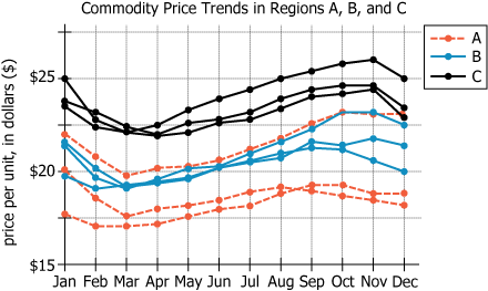
Over the last three years, a certain commodity was regularly sold in Regions A, B, and C. For each of the three regions, the graph shows the trend within each year of the monthly average price per unit of the commodity.
Based on the information provided, select from each drop-down menu the option that creates the most accurate statement.
On the assumption that the trends in the graph would continue, someone seeking to sell this commodity at the highest possible price would likely try to sell the commodity in Region , in either
.
ID: 700251
ShowHide Answer
Official Answer
Dropdown 1: C
Dropdown 2: October or November

Kudos
Bookmarks
gmatt1476
On the assumption that the trends in the graph would continue, someone seeking to sell this commodity at the highest possible price would likely try to sell the commodity in Region ____, in either ____
We need the region and the months of the highest possible price.
The Y axis of the graph depict the price of the commodity. The price is highest for Black lines which show the pricing for region C (we can see that in the key)
On the black lines, the pricing is highest in the months of October and November. Those points reflect the maximum prices.
ANSWER: Region C, October or November