Events & Promotions
|
|

GMAT Club Daily Prep
Thank you for using the timer - this advanced tool can estimate your performance and suggest more practice questions. We have subscribed you to Daily Prep Questions via email.
Customized
for You
Track
Your Progress
Practice
Pays
Not interested in getting valuable practice questions and articles delivered to your email? No problem, unsubscribe here.
 May 22
08:30 AM PDT
-09:30 AM PDT
For many Indian MBA applicants, the default dream has long been a top US MBA. But as career goals, visa considerations, timelines, and global mobility priorities evolve, more candidates are seriously considering MBA programs in Europe. May 21
10:00 AM EDT
-11:59 PM EDT
Make the most of your break with the most realistic GMAT™ prep. Take up to $700 off select products.- Jun 10
06:00 AM PDT
-06:15 PM PDT
Register for the GMAT Club Virtual MBA Spotlight Fair – the world’s premier event for serious MBA candidates. This is your chance to hear directly from Admissions Directors at nearly every Top 30 MBA program..

Kudos
Bookmarks

Dropdown 1: X
Dropdown 2: Z
Be sure to select an answer first to save it in the Error Log before revealing the correct answer (OA)!
Difficulty:
 85%
(hard)
85%
(hard)
Question Stats:
63% (02:47) correct 37%
(03:06)
wrong
based on 1175
sessions
37%
(03:06)
wrong
based on 1175
sessions
History
Date
Time
Result
Not Attempted Yet

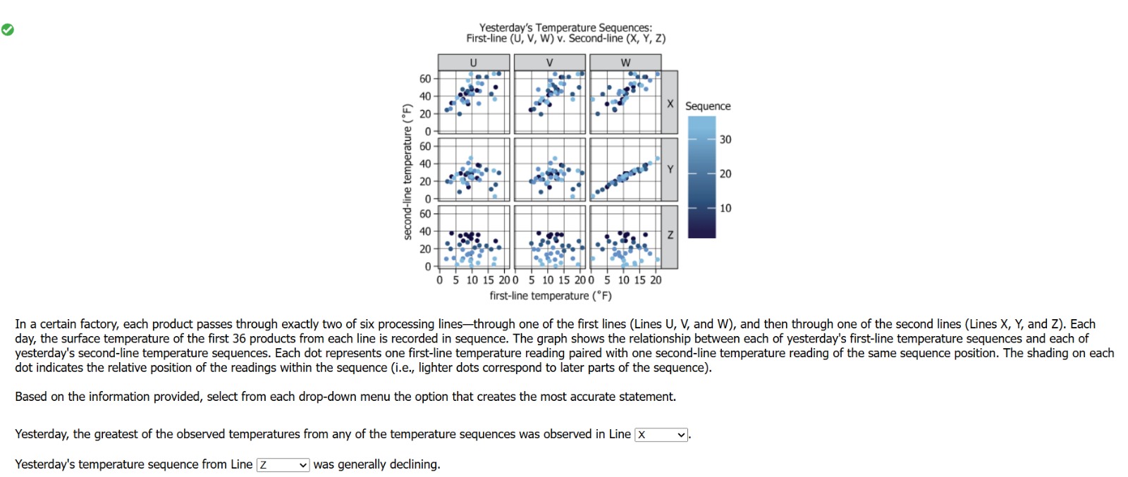
In a certain factory, each product passes through exactly two of six processing lines—through one of the first lines (Lines U, V, and W), and then through one of the second lines (Lines X, Y, and Z). Each day, the surface temperature of the first 36 products from each line is recorded in sequence. The graph shows the relationship between each of yesterday's first-line temperature sequences and each of yesterday's second-line temperature sequences. Each dot represents one first-line temperature reading paired with one second-line temperature reading of the same sequence position. The shading on each dot indicates the relative position of the readings within the sequence (i.e., lighter dots correspond to later parts of the sequence).
Based on the information provided, select from each drop-down menu the option that creates the most accurate statement.
Yesterday, the greatest of the observed temperatures from any of the temperature sequences was observed in Line .
Yesterday's temperature sequence from Line was generally declining.
ShowHide Answer
Official Answer
Dropdown 1: X
Dropdown 2: Z
Pro tip:
Combine official questions for familiarity with GMAT Club Tests for analytics and tougher Focus-level practice so the real exam feels manageable.
Explore →


Kudos
Bookmarks
In a certain factory, each product passes through exactly two of six processing lines—through one of the first lines (Lines U, V, and W), and then through one of the second lines (Lines X, Y, and Z). Each day, the surface temperature of the first 36 products from each line is recorded in sequence. The graph shows the relationship between each of yesterday's first-line temperature sequences and each of yesterday's second-line temperature sequences. Each dot represents one first-line temperature reading paired with one second-line temperature reading of the same sequence position. The shading on each dot indicates the relative position of the readings within the sequence (i.e., lighter dots correspond to later parts of the sequence).
We see that the first lines are depicted by the columns of the graph, with their temperature readings increasing from left to right in each little graph.
The second lines are depicted by the rows of the graph, with their temperature readings increasing from bottom to top in each little graph.
Based on the information provided, select from each drop-down menu the option that creates the most accurate statement.
Yesterday, the greatest of the observed temperatures from any of the temperature sequences was observed in Line _____.
The temperature readings for the first lines go up to a maximum of a little over 20.
The temperature readings for the second lines go up to a maximum of a little over 60.
Looking for the highest temperature in any line, we see that, in all three graphs for the X line, the maximum temperatures are above 60, and those are the highest temperatures found anywhere on the graph.
Select X.
Yesterday's temperature sequence from Line _____ was generally declining.
This question is tricky because we might expect declining temperatures to be represented by patterns on the graphs that decline from left to right. However, we have to keep in mind that left to right movement on each little graph represents not passing of time but rather increases in temperature.
As the passage says, passage of time is represented in the the following way on the graph:
The shading on each dot indicates the relative position of the readings within the sequence (i.e., lighter dots correspond to later parts of the sequence).
So, darker dots represent readings taken at earlier times, and lighter dots represent readings taken at later times.
Accordingly, a graph that shows temperatures declining over the period of time of a sequence will have darker dots, indicating earlier times, for higher temperature readings and lighter dots, indicating later times, for lower temperature readings.
Such a pattern indicates that the temperatures declined as the sequence progressed.
Scanning the graphs, we see that only the graphs for line Z have such a pattern, with darker dots toward the top of the graphs for higher temperature readings and lighter dots toward the bottoms of the graphs for lower temperature readings.
Select Z.
Correct answer: X, Z