Events & Promotions
|
|

GMAT Club Daily Prep
Thank you for using the timer - this advanced tool can estimate your performance and suggest more practice questions. We have subscribed you to Daily Prep Questions via email.
Customized
for You
Track
Your Progress
Practice
Pays
Not interested in getting valuable practice questions and articles delivered to your email? No problem, unsubscribe here.
 Apr 28
08:00 AM PDT
-11:00 AM PDT
Whether you are just beginning your MBA journey or fine-tuning your path to a 700+ score, GMAT Day is designed to give you a competitive edge. Apr 27
11:00 AM EDT
-12:00 PM EDT
Prefer video-based learning? The Target Test Prep OnDemand course is a one-of-a-kind video masterclass featuring 400 hours of lecture-style teaching by Scott Woodbury-Stewart, founder of Target Test Prep and one of the most accomplished GMAT instructors Apr 29
12:30 AM EDT
-01:30 AM EDT
Learn how Kamakshi achieved a GMAT 675 with an impressive 96th %ile in Data Insights. Discover the unique methods and exam strategies that helped her excel in DI along with other sections for a balanced and high score. Apr 30
01:30 AM EDT
-02:30 AM EDT
At one point, she believed GMAT wasn’t for her. After scoring 595, self-doubt crept in and she questioned her potential. But instead of quitting, she made the right strategic changes. The result? A remarkable comeback to 695. Check out how Saakshi did it. May 01
11:00 AM PDT
-12:00 PM PDT
Free- full-length test + 15 concept videos + 150+ short videos + study plan! May 03
06:30 AM PDT
-08:30 AM PDT
Verbal trouble on GMAT? Fix it NOW! Join Sunita Singhvi for a focused webinar on actionable strategies to boost your Verbal score and take your performance to the next level.

Kudos
Bookmarks

Dropdown 1: 600,000
Dropdown 2: 1,200,000
Be sure to select an answer first to save it in the Error Log before revealing the correct answer (OA)!
Difficulty:
 85%
(hard)
85%
(hard)
Question Stats:
60% (02:41) correct 40%
(02:51)
wrong
based on 3130
sessions
40%
(02:51)
wrong
based on 3130
sessions
History
Date
Time
Result
Not Attempted Yet

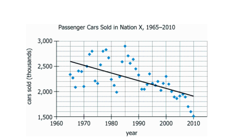
The graph shows the number of passenger cars sold in Nation X for each of the years 1965 through 2010, as well as with a trendline for this data.
From each drop-down menu, select the option that creates the most accurate statement based on the information provided.
For the year in which the greatest number of passenger cars was sold, that number was approximately greater than that indicated by the trend line.
If the number of passenger cars sold follows the pattern of the trendline, approximately passenger cars will be sold in 2055.
ID: 101120
ShowHide Answer
Official Answer
Dropdown 1: 600,000
Dropdown 2: 1,200,000
If this question felt shaky,
try an adaptive mini quiz of similar problems in
GMAT Club Forum Quiz →. Free plan gives 5 questions per day.

Oppenheimer1945
Joined: 16 Jul 2019
Last visit: 27 Apr 2026
Posts: 783
Given Kudos: 236
Location: India
Schools: INSEAD '26 (D) ISB '27 (D) IIMB '26 (A) IIMA '26 (A) HEC '26 (D) LBS '26 IESE '27 (D) Fuqua '27 (WL) Tepper '27 (WL)
GMAT Focus 1: 645 Q90 V76 DI80 
GPA: 7.81
Schools: INSEAD '26 (D) ISB '27 (D) IIMB '26 (A) IIMA '26 (A) HEC '26 (D) LBS '26 IESE '27 (D) Fuqua '27 (WL) Tepper '27 (WL)
GMAT Focus 1: 645 Q90 V76 DI80
Posts: 783
Kudos
Bookmarks
for 2nd part, we can see that the fall of trendline (y-axis) is 700,000 in 45 years (1965- 2010)
Hence for 2055 (2010+45 yrs), the Y-value will be 1900-700=120,000
Hence for 2055 (2010+45 yrs), the Y-value will be 1900-700=120,000

Mazbaul95
Joined: 20 Dec 2022
Last visit: 22 Apr 2026
Posts: 5
Given Kudos: 12
Location: Bangladesh
Concentration: Finance, Leadership
Schools: Kelley '27 (D) Johnson '27 (A$) Jones '26 (A$)
GMAT Focus 1: 655 Q86 V82 DI80
GMAT 1: 670 Q50 V30
GPA: 3.76
WE:Corporate Finance (Energy)
Schools: Kelley '27 (D) Johnson '27 (A$) Jones '26 (A$)
GMAT Focus 1: 655 Q86 V82 DI80
GMAT 1: 670 Q50 V30
Posts: 5
Kudos
Bookmarks
The second part can be solved easily:
Car sold in 1965: 2,600,000
Car sold in 2010: 1,900,000
So, in 45 years, the number of cars sold decreased by 700,000.
In the next 45 years, that means in 2055, the number of cars sold will decrease by 700,000.
So, 1,900,000-700,000=1,2000,000
Car sold in 1965: 2,600,000
Car sold in 2010: 1,900,000
So, in 45 years, the number of cars sold decreased by 700,000.
In the next 45 years, that means in 2055, the number of cars sold will decrease by 700,000.
So, 1,900,000-700,000=1,2000,000