Events & Promotions
|
|

GMAT Club Daily Prep
Thank you for using the timer - this advanced tool can estimate your performance and suggest more practice questions. We have subscribed you to Daily Prep Questions via email.
Customized
for You
Track
Your Progress
Practice
Pays
Not interested in getting valuable practice questions and articles delivered to your email? No problem, unsubscribe here.
 Jun 08
08:00 PM EDT
-10:00 PM EDT
Master the GMAT with expert live instruction, a personalized study plan, and real-time support. Includes 40 hours of online classes plus 6 months of access to the TTP GMAT OnDemand video course. Mon/Wed June 8, 2026 →August 12, 2026 8:00pm-10:00pm EST Jun 10
06:00 AM PDT
-06:15 PM PDT
Register for the GMAT Club Virtual MBA Spotlight Fair – the world’s premier event for serious MBA candidates. This is your chance to hear directly from Admissions Directors at nearly every Top 30 MBA program..- Jun 10
10:00 AM PDT
-11:00 AM PDT
Scoring 715 on the GMAT Focus Edition requires more than just learning formulas, memorizing concepts, or solving hundreds of questions. In this episode, Nishant shares how he improved his GMAT preparation by focusing on application of concepts, and more.  Jun 11
11:00 AM EDT
-01:00 PM EDT
TTP GMAT OnDemand gives serious students 400+ hours of expert video instruction, the full TTP course, AI support, weekly office hours, and a 715+ score guarantee—all built for elite GMAT score improvement.

Kudos
Bookmarks

Dropdown 1: 20% of the female
Dropdown 2: Infrequently
Be sure to select an answer first to save it in the Error Log before revealing the correct answer (OA)!
Difficulty:
 95%
(hard)
95%
(hard)
Question Stats:
56% (01:55) correct 44%
(02:25)
wrong
based on 2385
sessions
44%
(02:25)
wrong
based on 2385
sessions
History
Date
Time
Result
Not Attempted Yet
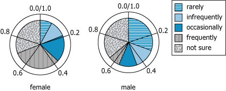
The two charts show how female and male survey respondents answered a question about how often they ate a certain type of food. The survey specified that "infrequently" meant more often than "rarely" but less often than "occasionally."
Select from the drop-down menus the options that create the statement that most accurately reflects the information provided.
Slightly less than respondents indicated that they ate the food at most .
ID: 700243 
GMAT-Club-Forum-c9b4jef4.png [ 276.51 KiB | Viewed 3372 times ]
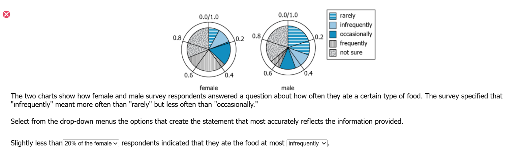
The two charts show how female and male survey respondents answered a question about how often they ate a certain type of food. The survey specified that "infrequently" meant more often than "rarely" but less often than "occasionally."
Select from the drop-down menus the options that create the statement that most accurately reflects the information provided.
Slightly less than respondents indicated that they ate the food at most .
ID: 700243
Attachment:
GMAT-Club-Forum-c9b4jef4.png [ 276.51 KiB | Viewed 3372 times ]
ShowHide Answer
Official Answer
Dropdown 1: 20% of the female
Dropdown 2: Infrequently
If this question felt shaky,
try an adaptive mini quiz of similar problems in
GMAT Club Forum Quiz →. Free plan gives 5 questions per day.

Kudos
Bookmarks
This is an amazing question that has at least 3 additional layers of complexity in it over and above what a typical Graphics Interpretation question entails.
Complexity # 1:
The dataset presents a qualitative scale that needs to be visualized into a scale such that we can translate what “atmost rarely or infrequently or occasionally” means.
Complexity # 2:
As you know a GI question has two blanks. Some of these blanks are two independent statements. And some have dependent blanks. This question statement is of the latter category and hence is worded such that we need to process both the blanks together. This interdependence increases the complexity of processing.
Complexity # 3:
The pie chart needs to be read and interpreted properly so that we can extract the correct information as required to answer the question asked.
So, as you go through this video solution pay close attention to how “owning the dataset” approach will help you navigate through the complexities in this GI question.
Let us know if you have any questions.

Kudos
Bookmarks
Quote:
The 0.2, 0.4 etc figures on the pie chart show the fraction of respondents corresponding to 20%, 40% etc.
So a bit less than 0.2 of the female respondents (say about 19%) said that they ate that food rarely (about 8%) or infrequently (about 11%) - approximately.
A bit less than 0.4 of the female respondents (say about 38%) said that they ate that food rarely (about 8%) or infrequently (about 11%) or occasionally (about 19%) - approximately.
and so on.
This is how you will read the graphs.
Slightly less than ____ respondents indicated that they ate the food at most ____.
When we say 'at most' we are including all the regions before it. So if I say "30% respondents said that they ate that food at most occasionally" it means that "30% respondents said that they ate that food rarely or infrequently or occasionally".
10% of male is the middle of rarely so more than 10% of males ate that food rarely. Hence this will not fit in the options.
A little less than 20% of females (about 19%) did say that they ate that food at most infrequently (i.e. rarely + infrequently). Hence this works.
ANSWER: 20% females, infrequently
Note that none of the other options work. 30% females is right in the "occasionally" section and 40% males are well into the "infrequently" section.
Check another pie chart graphical interpretation question here:
https://youtu.be/ilMxPjHNeic